
Angular 4 - Quick Guide
Angular 4 - Overview
There are three major releases of Angular. The first version that was released is Angular1, which is also called AngularJS. Angular1 was followed by Angular2, which came in with a lot of changes when compared to Angular1.
The structure of Angular is based on the components/services architecture. AngularJS was based on the model view controller. Angular 4 released in March 2017 proves to be a major breakthrough and is the latest release from the Angular team after Angular2.
Angular 4 is almost the same as Angular 2. It has a backward compatibility with Angular 2. Projects developed in Angular 2 will work without any issues with Angular 4.
Let us now see the new features and the changes made in Angular 4.
Why Angular4 and Not Angular3?
The Angular team faced some versioning issues internally with their modules and due to the conflict they had to move on and release the next version of Angular – the Angular4.
Let us now see the new features added to Angular 4 −
ngIf
Angular2 supported only the if condition. However, Angular 4 supports the if else condition as well. Let us see how it works using the ng-template.
<span *ngIf="isavailable; else condition1">Condition is valid.</span>
<ng-template #condition1>Condition is invalid</ng-template>
as keyword in for loop
With the help of as keyword you can store the value as shown below −
<div *ngFor="let i of months | slice:0:5 as total">
   Months: {{i}} Total: {{total.length}}
</div>
The variable total stores the output of the slice using the as keyword.
Animation Package
Animation in Angular 4 is available as a separate package and needs to be imported from @angular/animations. In Angular2, it was available with @angular/core. It is still kept the same for its backward compatibility aspect.
Template
Angular 4 uses <ng-template> as the tag instead of <template>; the latter was used in Angular2. The reason Angular 4 changed <template> to <ng-template> is because of the name conflict of the <template> tag with the html <template> standard tag. It will deprecate completely going ahead. This is one of the major changes in Angular 4.
TypeScript 2.2
Angular 4 is updated to a recent version of TypeScript, which is 2.2. This helps improve the speed and gives better type checking in the project.
Pipe Title Case
Angular 4 has added a new pipe title case, which changes the first letter of each word into uppercase.
<div>
   <h2>{{ 'Angular 4 titlecase' | titlecase }}</h2>
</div>
The above line of code generates the following output – Angular 4 Titlecase.
Http Search Parameters
Search parameters to the http get api is simplified. We do not need to call URLSearchParams for the same as was being done in Angular2.
Smaller and Faster Apps
Angular 4 applications are smaller and faster when compared to Angular2. It uses the TypeScript version 2.2, the latest version which makes the final compilation small in size.
Angular 4 - Environment Setup
In this chapter, we will discuss the Environment Setup required for Angular 4. To install Angular 4, we require the following −
- Nodejs
- Npm
- Angular CLI
- IDE for writing your code
Nodejs has to be greater than 4 and npm has to be greater than 3.
Nodejs
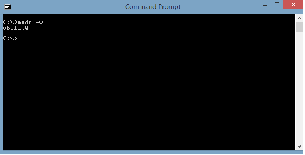
To check if nodejs is installed on your system, type node –v in the terminal. This will help you see the version of nodejs currently installed on your system.
C:\>node –v
v6.11.0
If it does not print anything, install nodejs on your system. To install nodejs, go the homepage https://nodejs.org/en/download/ of nodejs and install the package based on your OS.
The homepage of nodejs will look like the following −
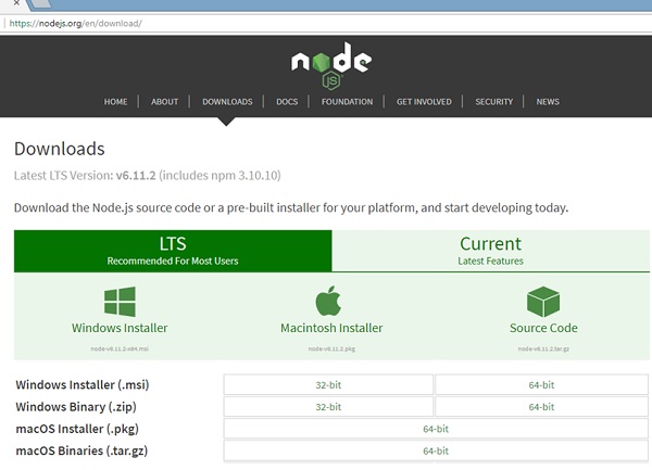
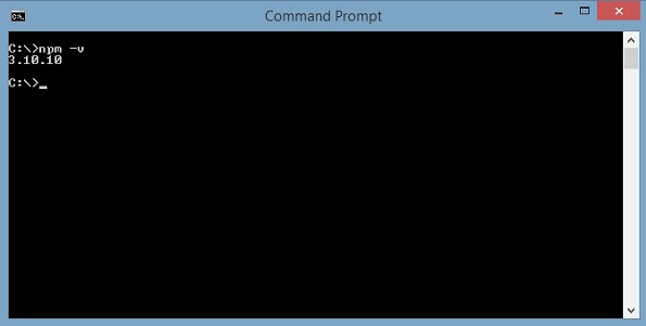
Based on your OS, install the required package. Once nodejs is installed, npm will also get installed along with it. To check if npm is installed or not, type npm –v in the terminal. It should display the version of the npm.
C:\>npm –v
5.3.0
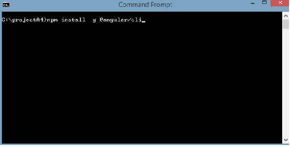
Angular 4 installations are very simple with the help of angular CLI. Visit the homepage https://cli.angular.io/ of angular to get the reference of the command.
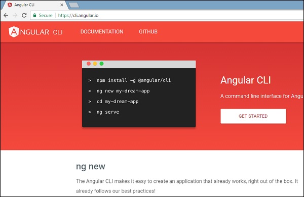
Type npm install –g @angular/cli, to install angular cli on your system.
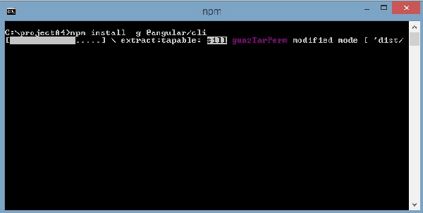
You will get the above installation in your terminal, once Angular CLI is installed. You can use any IDE of your choice, i.e., WebStorm, Atom, Visual Studio Code, etc.
The details of the project setup is explained in the next chapter.
Angular 4 - Project Setup
AngularJS is based on the model view controller, whereas Angular 2 is based on the components structure. Angular 4 works on the same structure as Angular2 but is faster when compared to Angular2.
Angular4 uses TypeScript 2.2 version whereas Angular 2 uses TypeScript version 1.8. This brings a lot of difference in the performance.
To install Angular 4, the Angular team came up with Angular CLI which eases the installation. You need to run through a few commands to install Angular 4.
Go to this site https://cli.angular.io to install Angular CLI.
To get started with the installation, we first need to make sure we have nodejs and npm installed with the latest version. The npm package gets installed along with nodejs.
Go to the nodejs site https://nodejs.org/en/.
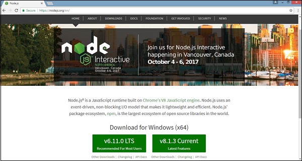
The latest version of Nodejs v6.11.0 is recommended for users. Users who already have nodejs greater than 4 can skip the above process. Once nodejs is installed, you can check the version of node in the command line using the command, node –v, as shown below −
The command prompt shows v6.11.0. Once nodejs is installed, npm will also get installed along with it.
To check the version of npm, type command npm –v in the terminal. It will display the version of npm as shown below.
The version of npm is 3.10.10. Now that we have nodejs and npm installed, let us run the angular cli commands to install Angular 4. You will see the following commands on the webpage −
npm install -g @angular/cli //command to install angular 4

ng new Angular 4-app // name of the project

cd my-dream-app

ng serve
Let us start with the first command in the command line and see how it works.
To start with, we will create an empty directory wherein, we will run the Angular CLI command.
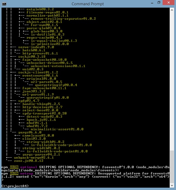
Enter the above command to install Angular 4. The installation process will start and will take a few minutes to complete.
Once the above command to install is complete, the following Command Prompt appears −
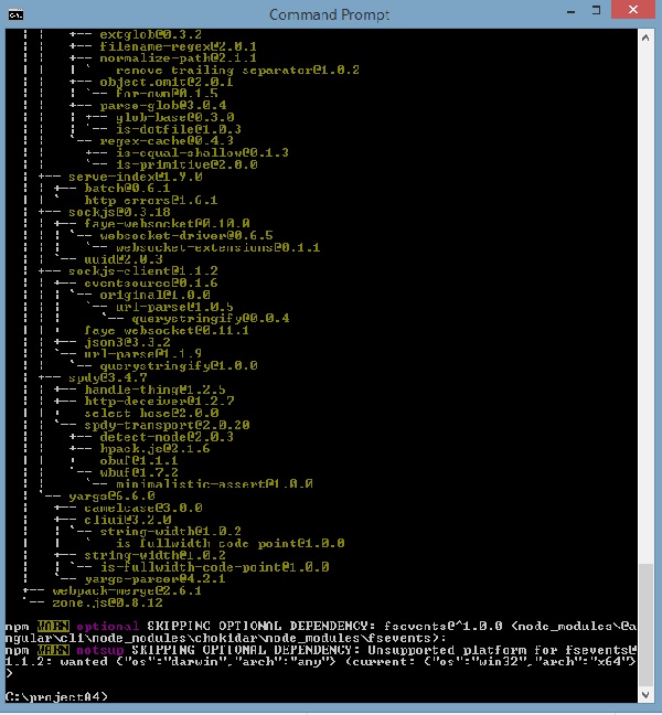
We have created an empty folder ProjectA4 and installed the Angular CLI command. We have also used -g to install Angular CLI globally. Now, you can create your Angular 4 project in any directory or folder and you don’t have to install Angular CLI project wise, as it is installed on your system globally and you can make use of it from any directory.
Let us now check whether Angular CLI is installed or not. To check the installation, run the following command in the terminal −
ng -v
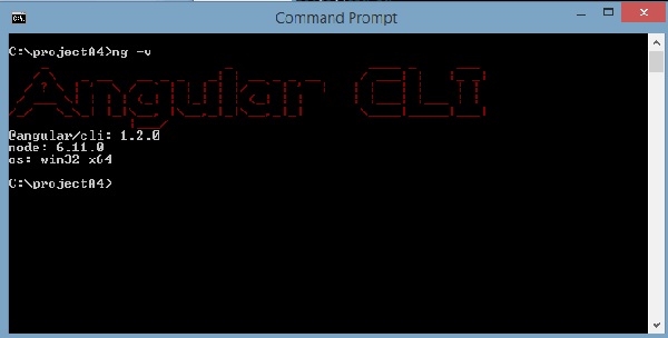
We get the @angular/cli version, which is at present 1.2.0. The node version running is 6.11.0 and also the OS details. The above details tell us that we have installed angular cli successfully and now we are ready to commence with our project.
We have now installed Angular 4. Let us now create our first project in Angular 4. To create a project in Angular 4, we will use the following command −
ng new projectname
We will name the project ng new Angular 4-app.
Let us now run the above command in the command line.
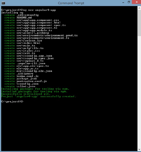
The project Angular 4-app is created successfully. It installs all the required packages necessary for our project to run in Angular 4. Let us now switch to the project created, which is in the directory Angular 4-app. Change the directory in the command line - cd Angular 4-app.
We will use Visual Studio Code IDE for working with Angular 4; you can use any IDE, i.e., Atom, WebStorm, etc.
To download Visual Studio Code, go to https://code.visualstudio.com/ and click Download for Windows.
Click Download for Windows for installing the IDE and run the setup to start using IDE.
The Editor looks as follows −
We have not started any project in it. Let us now take the project we have created using angular-cli.
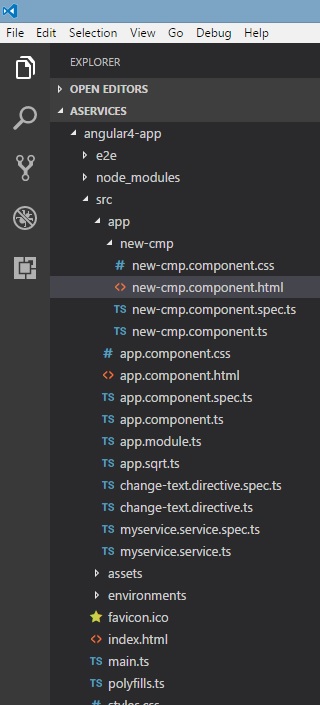
We will consider the Angular 4-app project. Let us open the Angular 4-app and see how the folder structure looks like.
Now that we have the file structure for our project, let us compile our project with the following command −
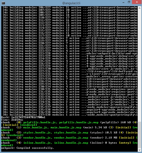
ng serve
The ng serve command builds the application and starts the web server.
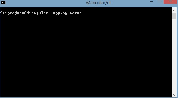
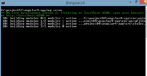
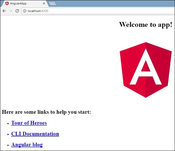
The web server starts on port 4200. Type the url https://localhost:4200/ in the browser and see the output. Once the project is compiled, you will receive the following output −
Once you run https://localhost:4200/ in the browser, you will be directed to the following screen −
Let us now make some changes to display the following content −
“Welcome to Angular 4 project”
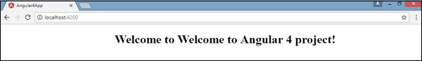
We have made changes in the files – app.component.html and app.component.ts. We will discuss more about this in our subsequent chapters.
Let us complete the project setup. If you see we have used port 4200, which is the default port that angular–cli makes use of while compiling. You can change the port if you wish using the following command −
ng serve --host 0.0.0.0 –port 4205
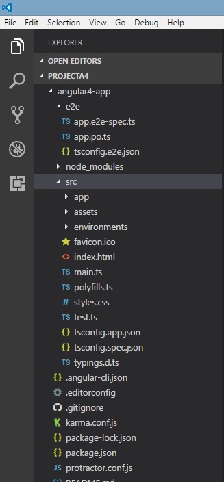
The Angular 4 app folder has the following folder structure −
e2e − end to end test folder. Mainly e2e is used for integration testing and helps ensure the application works fine.
node_modules − The npm package installed is node_modules. You can open the folder and see the packages available.
src − This folder is where we will work on the project using Angular 4.
The Angular 4 app folder has the following file structure −
.angular-cli.json − It basically holds the project name, version of cli, etc.
.editorconfig − This is the config file for the editor.
.gitignore − A .gitignore file should be committed into the repository, in order to share the ignore rules with any other users that clone the repository.
karma.conf.js − This is used for unit testing via the protractor. All the information required for the project is provided in karma.conf.js file.
package.json − The package.json file tells which libraries will be installed into node_modules when you run npm install.
At present, if you open the file in the editor, you will get the following modules added in it.
"@angular/animations": "^4.0.0",
"@angular/common": "^4.0.0",
"@angular/compiler": "^4.0.0",
"@angular/core": "^4.0.0",
"@angular/forms": "^4.0.0",
"@angular/http": "^4.0.0",
"@angular/platform-browser": "^4.0.0",
"@angular/platform-browser-dynamic": "^4.0.0",
"@angular/router": "^4.0.0",
In case you need to add more libraries, you can add those over here and run the npm install command.
protractor.conf.js − This is the testing configuration required for the application.
tsconfig.json − This basically contains the compiler options required during compilation.
tslint.json − This is the config file with rules to be considered while compiling.
The src folder is the main folder, which internally has a different file structure.
app
It contains the files described below. These files are installed by angular-cli by default.
app.module.ts − If you open the file, you will see that the code has reference to different libraries, which are imported. Angular-cli has used these default libraries for the import – angular/core, platform-browser. The names itself explain the usage of the libraries.
They are imported and saved into variables such as declarations, imports, providers, and bootstrap.
import { BrowserModule } from '@angular/platform-browser';
import { NgModule } from '@angular/core';
import { AppComponent } from './app.component';

@NgModule({
   declarations: [
      AppComponent
   ],
   imports: [
      BrowserModule
   ],
   providers: [],
   bootstrap: [AppComponent]
})

export class AppModule { }
declarations − In declarations, the reference to the components is stored. The Appcomponent is the default component that is created whenever a new project is initiated. We will learn about creating new components in a different section.
imports − This will have the modules imported as shown above. At present, BrowserModule is part of the imports which is imported from @angular/platform-browser.
providers − This will have reference to the services created. The service will be discussed in a subsequent chapter.
bootstrap − This has reference to the default component created, i.e., AppComponent.
app.component.css − You can write your css structure over here. Right now, we have added the background color to the div as shown below.
.divdetails{
   background-color: #ccc;
}
app.component.html − The html code will be available in this file.
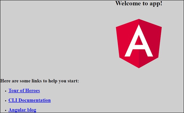
<!--The content below is only a placeholder and can be replaced.-->
<div class = "divdetails">
   <div style = "text-align:center">
      <h1>
         Welcome to {{title}}!
      </h1>
      <img width = "300" src = "data:image/svg+xml;base64,PD94bWwgdmVyc2lvbj0iMS4wIiBlbmNv
      ZGluZz0idXRmLTgiPz4NCjwhLS0gR2VuZXJhdG9yOiBBZG9iZSBJbGx1c3RyYXRvciAxOS4xLjAsIFNWRyBFe
      HBvcnQgUGx1Zy1JbiAuIFNWRyBWZXJzaW9uOiA2LjAwIEJ1aWxkIDApICAtLT4NCjxzdmcgdmVyc2lvbj0iMS4
      xIiBpZD0iTGF5ZXJfMSIgeG1sbnM9Imh0dHA6Ly93d3cudzMub3JnLzIwMDAvc3ZnIiB4bWxuczp4bGluaz0iaH
      R0cDovL3d3dy53My5vcmcvMTk5OS94bGluayIgeD0iMHB4IiB5PSIwcHgiDQoJIHZpZXdCb3g9IjAgMCAyNTAg
      MjUwIiBzdHlsZT0iZW5hYmxlLWJhY2tncm91bmQ6bmV3IDAgMCAyNTAgMjUwOyIgeG1sOnNwYWNlPSJwcmVzZXJ2
      ZSI+DQo8c3R5bGUgdHlwZT0idGV4dC9jc3MiPg0KCS5zdDB7ZmlsbDojREQwMDMxO30NCgkuc3Qxe2ZpbGw6I0M
      zMDAyRjt9DQoJLnN0MntmaWxsOiNGRkZGRkY7fQ0KPC9zdHlsZT4NCjxnPg0KCTxwb2x5Z29uIGNsYXNzPSJzdD
      AiIHBvaW50cz0iMTI1LDMwIDEyNSwzMCAxMjUsMzAgMzEuOSw2My4yIDQ2LjEsMTg2LjMgMTI1LDIzMCAxMjUsMj
      MwIDEyNSwyMzAgMjAzLjksMTg2LjMgMjE4LjEsNjMuMiAJIi8+DQoJPHBvbHlnb24gY2xhc3M9InN0MSIgcG9pbn
      RzPSIxMjUsMzAgMTI1LDUyLjIgMTI1LDUyLjEgMTI1LDE1My40IDEyNSwxNTMuNCAxMjUsMjMwIDEyNSwyMzAgMj
      AzLjksMTg2LjMgMjE4LjEsNjMuMiAxMjUsMzAgCSIvPg0KCTxwYXRoIGNsYXNzPSJzdDIiIGQ9Ik0xMjUsNTIuMU
      w2Ni44LDE4Mi42aDBoMjEuN2gwbDExLjctMjkuMmg0OS40bDExLjcsMjkuMmgwaDIxLjdoMEwxMjUsNTIuMUwxMj
      UsNTIuMUwxMjUsNTIuMUwxMjUsNTIuMQ0KCQlMMTI1LDUyLjF6IE0xNDIsMTM1LjRIMTA4bDE3LTQwLjlMMTQyLD
      EzNS40eiIvPg0KPC9nPg0KPC9zdmc+DQo=">
   </div>
   <h2>Here are some links to help you start: </h2>
   <ul>
      <li>
         <h2>
            <a target = "_blank" href="https://angular.io/tutorial">Tour of Heroes</a>
         </h2>
      </li>
      <li>
         <h2>
            <a target = "_blank" href = "https://github.com/angular/angular-cli/wiki">
               CLI Documentation
            </a>
         </h2>
      </li>
      <li>
         <h2>
            <a target="_blank" href="https://angularjs.blogspot.ca/">Angular blog</a>
         </h2>
      </li>
   </ul>
</div>
This is the default html code currently available with the project creation.
app.component.spec.ts − These are automatically generated files which contain unit tests for source component.
app.component.ts − The class for the component is defined over here. You can do the processing of the html structure in the .ts file. The processing will include activities such as connecting to the database, interacting with other components, routing, services, etc.
The structure of the file is as follows −
import { Component } from '@angular/core';

@Component({
   selector: 'app-root',
   templateUrl: './app.component.html',
   styleUrls: ['./app.component.css']
})
export class AppComponent {
   title = 'app';
}
Assets
You can save your images, js files in this folder.
Environment
This folder has the details for the production or the dev environment. The folder contains two files.
- environment.prod.ts
- environment.ts
Both the files have details of whether the final file should be compiled in the production environment or the dev environment.
The additional file structure of Angular 4 app folder includes the following −
favicon.ico
This is a file that is usually found in the root directory of a website.
index.html
This is the file which is displayed in the browser.
<!doctype html>
<html lang = "en">
   <head>
      <meta charset = "utf-8">
      <title>HTTP Search Param</title>
      <base href = "/">
      <link href = "https://fonts.googleapis.com/icon?family=Material+Icons" rel="stylesheet">
      <link href = "https://fonts.googleapis.com/css?family=Roboto|Roboto+Mono" rel="stylesheet">
      <link href = "styles.c7c7b8bf22964ff954d3.bundle.css" rel="stylesheet">
      <meta name = "viewport" content="width=device-width, initial-scale=1">
      <link rel = "icon" type="image/x-icon" href="favicon.ico">
   </head>

   <body>
      <app-root></app-root>
   </body>
</html>
The body has <app-root></app-root>. This is the selector which is used in app.component.ts file and will display the details from app.component.html file.
main.ts
main.ts is the file from where we start our project development. It starts with importing the basic module which we need. Right now if you see angular/core, angular/platform-browser-dynamic, app.module and environment is imported by default during angular-cli installation and project setup.
import { enableProdMode } from '@angular/core';
import { platformBrowserDynamic } from '@angular/platform-browser-dynamic';

import { AppModule } from './app/app.module';
import { environment } from './environments/environment';

if (environment.production) {
   enableProdMode();
}
platformBrowserDynamic().bootstrapModule(AppModule);
The platformBrowserDynamic().bootstrapModule(AppModule) has the parent module reference AppModule. Hence, when it executes in the browser, the file that is called is index.html. Index.html internally refers to main.ts which calls the parent module, i.e., AppModule when the following code executes −
platformBrowserDynamic().bootstrapModule(AppModule);
When AppModule is called, it calls app.module.ts which further calls the AppComponent based on the boostrap as follows −
bootstrap: [AppComponent]
In app.component.ts, there is a selector: app-root which is used in the index.html file. This will display the contents present in app.component.html.
The following will be displayed in the browser −
polyfill.ts
This is mainly used for backward compatibility.
styles.css
This is the style file required for the project.
test.ts
Here, the unit test cases for testing the project will be handled.
tsconfig.app.json
This is used during compilation, it has the config details that need to be used to run the application.
tsconfig.spec.json
This helps maintain the details for testing.
typings.d.ts
It is used to manage the TypeScript definition.
The final file structure looks as follows −
Angular 4 - Components
Major part of the development with Angular 4 is done in the components. Components are basically classes that interact with the .html file of the component, which gets displayed on the browser. We have seen the file structure in one of our previous chapters. The file structure has the app component and it consists of the following files −
app.component.css
app.component.html
app.component.spec.ts
app.component.ts
app.module.ts
The above files were created by default when we created new project using the angular-cli command.
If you open up the app.module.ts file, it has some libraries which are imported and also a declarative which is assigned the appcomponent as follows −
import { BrowserModule } from '@angular/platform-browser';
import { NgModule } from '@angular/core';
import { AppComponent } from './app.component';

@NgModule({
   declarations: [
      AppComponent
   ],
   imports: [
      BrowserModule
   ],
   providers: [],
   bootstrap: [AppComponent]
})

export class AppModule { }
The declarations include the AppComponent variable, which we have already imported. This becomes the parent component.
Now, angular-cli has a command to create your own component. However, the app component which is created by default will always remain the parent and the next components created will form the child components.
Let us now run the command to create the component.
ng g component new-cmp
When you run the above command in the command line, you will receive the following output −
C:\projectA4\Angular 4-app>ng g component new-cmp
installing component
   create src\app\new-cmp\new-cmp.component.css
   create src\app\new-cmp\new-cmp.component.html
   create src\app\new-cmp\new-cmp.component.spec.ts
   create src\app\new-cmp\new-cmp.component.ts
   update src\app\app.module.ts
Now, if we go and check the file structure, we will get the new-cmp new folder created under the src/app folder.
The following files are created in the new-cmp folder −
new-cmp.component.css − css file for the new component is created.
new-cmp.component.html − html file is created.
new-cmp.component.spec.ts − this can be used for unit testing.
new-cmp.component.ts − here, we can define the module, properties, etc.
Changes are added to the app.module.ts file as follows −
import { BrowserModule } from '@angular/platform-browser';
import { NgModule } from '@angular/core';
import { AppComponent } from './app.component';
import { NewCmpComponent } from './new-cmp/new-cmp.component';
// includes the new-cmp component we created

@NgModule({
   declarations: [
      AppComponent,
      NewCmpComponent // here it is added in declarations and will behave as a child component
   ],
   imports: [
      BrowserModule
   ],
   providers: [],
   bootstrap: [AppComponent] //for bootstrap the AppComponent the main app component is given.
})

export class AppModule { }
The new-cmp.component.ts file is generated as follows −
import { Component, OnInit } from '@angular/core'; // here angular/core is imported .

@Component({
   // this is a declarator which starts with @ sign. The component word marked in bold needs to be the same.
   selector: 'app-new-cmp', //
   templateUrl: './new-cmp.component.html',
   // reference to the html file created in the new component.
   styleUrls: ['./new-cmp.component.css'] // reference to the style file.
})

export class NewCmpComponent implements OnInit {
   constructor() { }
   ngOnInit() {}
}
If you see the above new-cmp.component.ts file, it creates a new class called NewCmpComponent, which implements OnInit.In, which has a constructor and a method called ngOnInit(). ngOnInit is called by default when the class is executed.
Let us check how the flow works. Now, the app component, which is created by default becomes the parent component. Any component added later becomes the child component.
When we hit the url in the https://localhost:4200/ browser, it first executes the index.html file which is shown below −
<!doctype html>
<html lang = "en">
   <head>
      <meta charset = "utf-8">
      <title>Angular 4App</title>
      <base href = "/">
      <meta name="viewport" content="width = device-width, initial-scale = 1">
      <link rel = "icon" type = "image/x-icon" href = "favicon.ico">
   </head>

   <body>
      <app-root></app-root>
   </body>
</html>
The above is the normal html file and we do not see anything that is printed in the browser. Take a look at the tag in the body section.
<app-root></app-root>
This is the root tag created by the Angular by default. This tag has the reference in the main.ts file.
import { enableProdMode } from '@angular/core';
import { platformBrowserDynamic } from '@angular/platform-browser-dynamic';
import { AppModule } from './app/app.module';
import { environment } from './environments/environment';

if (environment.production) {
   enableProdMode();
}

platformBrowserDynamic().bootstrapModule(AppModule);
AppModule is imported from the app of the main parent module, and the same is given to the bootstrap Module, which makes the appmodule load.
Let us now see the app.module.ts file −
import { BrowserModule } from '@angular/platform-browser';
import { NgModule } from '@angular/core';
import { AppComponent } from './app.component';
import { NewCmpComponent } from './new-cmp/new-cmp.component';

@NgModule({
   declarations: [
      AppComponent,
      NewCmpComponent
   ],
   imports: [
      BrowserModule
   ],
   providers: [],
   bootstrap: [AppComponent]
})

export class AppModule { }
Here, the AppComponent is the name given, i.e., the variable to store the reference of the app. Component.ts and the same is given to the bootstrap. Let us now see the app.component.ts file.
import { Component } from '@angular/core';

@Component({
   selector: 'app-root',
   templateUrl: './app.component.html',
   styleUrls: ['./app.component.css']
})

export class AppComponent {
   title = 'Angular 4 Project!';
}
Angular core is imported and referred as the Component and the same is used in the Declarator as −
@Component({
   selector: 'app-root',
   templateUrl: './app.component.html',
   styleUrls: ['./app.component.css']
})
In the declarator reference to the selector, templateUrl and styleUrl are given. The selector here is nothing but the tag which is placed in the index.html file that we saw above.
The class AppComponent has a variable called title, which is displayed in the browser.
The @Component uses the templateUrl called app.component.html which is as follows −
<!--The content below is only a placeholder and can be replaced.-->
<div style="text-align:center">
   <h1>
      Welcome to {{title}}.
   </h1>
</div>
It has just the html code and the variable title in curly brackets. It gets replaced with the value, which is present in the app.component.ts file. This is called binding. We will discuss the concept of binding in a subsequent chapter.
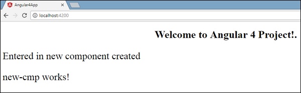
Now that we have created a new component called new-cmp. The same gets included in the app.module.ts file, when the command is run for creating a new component.
app.module.ts has a reference to the new component created.
Let us now check the new files created in new-cmp.
new-cmp.component.ts
import { Component, OnInit } from '@angular/core';
@Component({
   selector: 'app-new-cmp',
   templateUrl: './new-cmp.component.html',
   styleUrls: ['./new-cmp.component.css']
})

export class NewCmpComponent implements OnInit {
   constructor() { }
   ngOnInit() {}
}
Here, we have to import the core too. The reference of the component is used in the declarator.
The declarator has the selector called app-new-cmp and the templateUrl and styleUrl.
The .html called new-cmp.component.html is as follows −
<p>
   new-cmp works!
</p>
As seen above, we have the html code, i.e., the p tag. The style file is empty as we do not need any styling at present. But when we run the project, we do not see anything related to the new component getting displayed in the browser. Let us now add something and the same can be seen in the browser later.
The selector, i.e., app-new-cmp needs to be added in the app.component .html file as follows −
<!--The content below is only a placeholder and can be replaced.-->
<div style="text-align:center">
   <h1>
      Welcome to {{title}}.
   </h1>
</div>

<app-new-cmp></app-new-cmp>
When the <app-new-cmp></app-new-cmp> tag is added, all that is present in the .html file of the new component created will get displayed on the browser along with the parent component data.
Let us see the new component .html file and the new-cmp.component.ts file.
new-cmp.component.ts
import { Component, OnInit } from '@angular/core';

@Component({
   selector: 'app-new-cmp',
   templateUrl: './new-cmp.component.html',
   styleUrls: ['./new-cmp.component.css']
})

export class NewCmpComponent implements OnInit {
   newcomponent = "Entered in new component created";
   constructor() {}
   ngOnInit() { }
}
In the class, we have added one variable called new component and the value is “Entered in new component created”.
The above variable is bound in the .new-cmp.component.html file as follows −
<p>
   {{newcomponent}}
</p>

<p>
   new-cmp works!
</p>
Now since we have included the <app-new-cmp></app-new-cmp> selector in the app. component .html which is the .html of the parent component, the content present in the new component .html file (new-cmp.component.html) gets displayed on the browser as follows −
Similarly, we can create components and link the same using the selector in the app.component.html file as per our requirements.
Angular 4 - Module
Module in Angular refers to a place where you can group the components, directives, pipes, and services, which are related to the application.
In case you are developing a website, the header, footer, left, center and the right section become part of a module.
To define module, we can use the NgModule. When you create a new project using the Angular –cli command, the ngmodule is created in the app.module.ts file by default and it looks as follows −
import { BrowserModule } from '@angular/platform-browser';
import { NgModule } from '@angular/core';
import { AppComponent } from './app.component';

@NgModule({
   declarations: [
      AppComponent
   ],
   imports: [
      BrowserModule
   ],
   providers: [],
   bootstrap: [AppComponent]
})

export class AppModule { }
The NgModule needs to be imported as follows −
import { NgModule } from '@angular/core';
The structure for the ngmodule is as shown below −
@NgModule({
   declarations: [
      AppComponent
   ],
   imports: [
      BrowserModule
   ],
   providers: [],
   bootstrap: [AppComponent]
})
It starts with @NgModule and contains an object which has declarations, import s, providers and bootstrap.
Declaration
It is an array of components created. If any new component gets created, it will be imported first and the reference will be included in declarations as shown below −
declarations: [
   AppComponent,
   NewCmpComponent
]
Import
It is an array of modules required to be used in the application. It can also be used by the components in the Declaration array. For example, right now in the @NgModule we see the Browser Module imported. In case your application needs forms, you can include the module as follows −
import { FormsModule } from '@angular/forms';
The import in the @NgModule will be like the following −
imports: [
   BrowserModule,
   FormsModule
]
Providers
This will include the services created.
Bootstrap
This includes the main app component for starting the execution.
Angular 4 - Data Binding
Data Binding is available right from AngularJS, Angular 2 and is now available in Angular 4 as well. We use curly braces for data binding - {{}}; this process is called interpolation. We have already seen in our previous examples how we declared the value to the variable title and the same is printed in the browser.
The variable in the app.component.html file is referred as {{title}} and the value of title is initialized in the app.component.ts file and in app.component.html, the value is displayed.
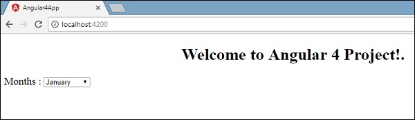
Let us now create a dropdown of months in the browser. To do that , we have created an array of months in app.component.ts as follows −
import { Component } from '@angular/core';

@Component({
   selector: 'app-root',
   templateUrl: './app.component.html',
   styleUrls: ['./app.component.css']
})
export class AppComponent {
   title = 'Angular 4 Project!';
   // declared array of months.
   months = ["January", "Feburary", "March", "April", "May",
            "June", "July", "August", "September",
            "October", "November", "December"];
}
The month’s array that is shown above is to be displayed in a dropdown in the browser. For this, we will use the following line of code −
<!--The content below is only a placeholder and can be replaced. -->
<div style="text-align:center">
   <h1>
      Welcome to {{title}}.
   </h1>
</div>

<div> Months :
   <select>
      <option *ngFor="let i of months">{{i}}</option>
   </select>
</div>
We have created the normal select tag with option. In option, we have used the for loop. The for loop is used to iterate over the months’ array, which in turn will create the option tag with the value present in the months.
The syntax for in Angular is *ngFor = “let I of months” and to get the value of months we are displaying it in {{i}}.
The two curly brackets help with data binding. You declare the variables in your app.component.ts file and the same will be replaced using the curly brackets.
Let us see the output of the above month’s array in the browser
The variable that is set in the app.component.ts can be bound with the app.component.html using the curly brackets; for example, {{}}.
Let us now display the data in the browser based on condition. Here, we have added a variable and assigned the value as true. Using the if statement, we can hide/show the content to be displayed.
Example
import { Component } from '@angular/core';

@Component({
   selector: 'app-root',
   templateUrl: './app.component.html',
   styleUrls: ['./app.component.css']
})

export class AppComponent {
   title = 'Angular 4 Project!';
   //array of months.
   months = ["January", "February", "March", "April",
            "May", "June", "July", "August", "September",
            "October", "November", "December"];
   isavailable = true;   //variable is set to true
}
<!--The content below is only a placeholder and can be replaced.-->
<div style = "text-align:center">
<h1>
Welcome to {{title}}.
</h1>
</div>
<div> Months :
<select>
<option *ngFor = "let i of months">{{i}}</option>
</select>
</div>
<br/>
<div>
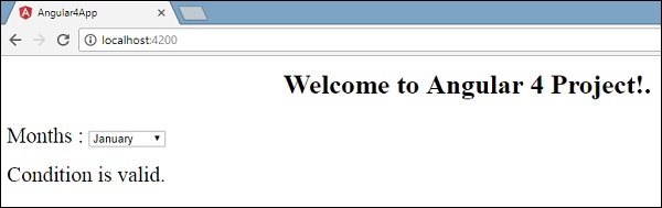
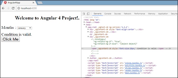
<span *ngIf = "isavailable">Condition is valid.</span>
//over here based on if condition the text condition is valid is displayed.
If the value of isavailable is set to false it will not display the text.
</div>
Output
Let us try the above example using the IF THEN ELSE condition.
Example
import { Component } from '@angular/core';

@Component({
   selector: 'app-root',
   templateUrl: './app.component.html',
   styleUrls: ['./app.component.css']
})

export class AppComponent {
   title = 'Angular 4 Project!';
   //array of months.
   months = ["January", "February", "March", "April",
            "May", "June", "July", "August", "September",
            "October", "November", "December"];
   isavailable = false;
}
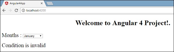
In this case, we have made the isavailable variable as false. To print the else condition, we will have to create the ng-template as follows −
<ng-template #condition1>Condition is invalid</ng-template>
The full code looks like this −
<!--The content below is only a placeholder and can be replaced.-->
<div style="text-align:center">
   <h1>
      Welcome to {{title}}.
   </h1>
</div>

<div> Months :
   <select>
      <option *ngFor="let i of months">{{i}}</option>
   </select>
</div>
<br/>

<div>
   <span *ngIf="isavailable; else condition1">Condition is valid.</span>
   <ng-template #condition1>Condition is invalid</ng-template>
</div>
If is used with the else condition and the variable used is condition1. The same is assigned as an id to the ng-template, and when the available variable is set to false the text Condition is invalid is displayed.
The following screenshot shows the display in the browser.
Let us now use the if then else condition.
import { Component } from '@angular/core';

@Component({
   selector: 'app-root',
   templateUrl: './app.component.html',
   styleUrls: ['./app.component.css']
})

export class AppComponent {
   title = 'Angular 4 Project!';
   //array of months.
   months = ["January", "February", "March", "April",
            "May", "June", "July", "August", "September",
            "October", "November", "December"];
   isavailable = true;
}
Now, we will make the variable isavailable as true. In the html, the condition is written in the following way −
<!--The content below is only a placeholder and can be replaced.-->
<div style="text-align:center">
<h1>
Welcome to {{title}}.
</h1>
</div>
<div> Months :
<select>
<option *ngFor="let i of months">{{i}}</option>
</select>
</div>
<br/>
<div>
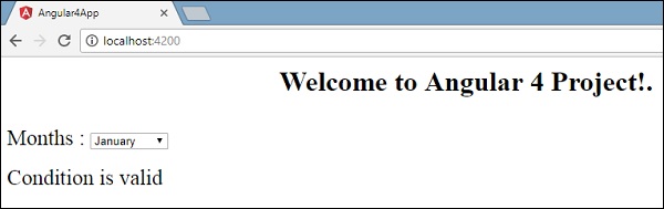
<span *ngIf="isavailable; then condition1 else condition2">Condition is valid.</span>
<ng-template #condition1>Condition is valid</ng-template>
<ng-template #condition2>Condition is invalid</ng-template>
</div>
If the variable is true, then condition1, else condition2. Now, two templates are created with id #condition1 and #condition2.
The display in the browser is as follows −
Angular 4 - Event Binding
In this chapter, we will discuss how Event Binding works in Angular 4. When a user interacts with an application in the form of a keyboard movement, a mouse click, or a mouseover, it generates an event. These events need to be handled to perform some kind of action. This is where event binding comes into picture.
Let us consider an example to understand this better.
app.component.html
<!--The content below is only a placeholder and can be replaced.-->
<div style = "text-align:center">
<h1>
Welcome to {{title}}.
</h1>
</div>
<div> Months :
<select>
<option *ngFor = "let i of months">{{i}}</option>
</select>
</div>
<br/>
<div>
<span *ngIf = "isavailable; then condition1 else condition2">
Condition is valid.
</span>
<ng-template #condition1>Condition is valid</ng-template>
<ng-template #condition2>Condition is invalid</ng-template>
</div>
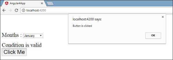
<button (click)="myClickFunction($event)">
Click Me
</button>
In the app.component.html file, we have defined a button and added a function to it using the click event.
Following is the syntax to define a button and add a function to it.
(click)="myClickFunction($event)"
The function is defined in the .ts file: app.component.ts
import { Component } from '@angular/core';

@Component({
   selector: 'app-root',
   templateUrl: './app.component.html',
   styleUrls: ['./app.component.css']
})

export class AppComponent {
   title = 'Angular 4 Project!';
   //array of months.
   months = ["January", "Feburary", "March", "April",
      "May", "June", "July", "August", "September",
      "October", "November", "December"];
   isavailable = true;
   myClickFunction(event) {
      //just added console.log which will display the event details in browser on click of the button.
      alert("Button is clicked");
      console.log(event);
   }
}
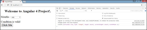
Upon clicking the button, the control will come to the function myClickFunction and a dialog box will appear, which displays the Button is clicked as shown in the following screenshot −
Let us now add the change event to the dropdown.
The following line of code will help you add the change event to the dropdown −
<!--The content below is only a placeholder and can be replaced.-->
<div style = "text-align:center">
   <h1>
      Welcome to {{title}}.
   </h1>
</div>

<div> Months :
   <select (change) = "changemonths($event)">
      <option *ngFor = "let i of months">{{i}}</option>
   </select>
</div>
<br/>

<div>
   <span *ngIf = "isavailable; then condition1 else condition2">
      Condition is valid.
   </span>
   <ng-template #condition1>Condition is valid</ng-template>
   <ng-template #condition2>Condition is invalid</ng-template>
</div>

<button (click) = "myClickFunction($event)">Click Me</button>
The function is declared in the app.component.ts file −
import { Component } from '@angular/core';

@Component({
   selector: 'app-root',
   templateUrl: './app.component.html',
   styleUrls: ['./app.component.css']
})

export class AppComponent {
   title = 'Angular 4 Project!';
   //array of months.
   months = ["January", "Feburary", "March", "April",
      "May", "June", "July", "August", "September",
      "October", "November", "December"];
   isavailable = true;
   myClickFunction(event) {
      alert("Button is clicked");
      console.log(event);
   }
   changemonths(event) {
      console.log("Changed month from the Dropdown");
      console.log(event);
   }
}
The console message “Changed month from the Dropdown” is displayed in the console along with the event.
Let us add an alert message in app.component.ts when the value from the dropdown is changed as shown below −
import { Component } from '@angular/core';

@Component({
   selector: 'app-root',
   templateUrl: './app.component.html',
   styleUrls: ['./app.component.css']
})

export class AppComponent {
   title = 'Angular 4 Project!';
   //array of months.
   months = ["January", "February", "March", "April",
         "May", "June", "July", "August", "September",
         "October", "November", "December"];

   isavailable = true;
   myClickFunction(event) {
      //just added console.log which will display the event details in browser
      on click of the button.
      alert("Button is clicked");
      console.log(event);
   }
   changemonths(event) {
      alert("Changed month from the Dropdown");
   }
}
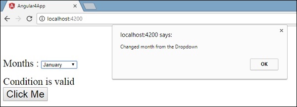
When the value in dropdown is changed, a dialog box will appear and the following message will be displayed - “Changed month from the Dropdown”.
Angular 4 - Templates
Angular 4 uses the <ng-template> as the tag instead of <template> which is used in Angular2. The reason Angular 4 changed <template> to <ng-template> is because there is a name conflict between the <template> tag and the html <template> standard tag. It will deprecate completely going ahead. This is one of the major changes in Angular 4.
Let us now use the template along with the if else condition and see the output.
app.component.html
<!--The content below is only a placeholder and can be replaced.-->
<div style = "text-align:center">
   <h1>
      Welcome to {{title}}.
   </h1>
</div>

<div> Months :
   <select (change) = "changemonths($event)" name = "month">
      <option *ngFor = "let i of months">{{i}}</option>
   </select>
</div>
<br/>

<div>
   <span *ngIf = "isavailable;then condition1 else condition2">Condition is valid.</span>
   <ng-template #condition1>Condition is valid from template</ng-template>
   <ng-template #condition2>Condition is invalid from template</ng-template>
</div>
<button (click) = "myClickFunction($event)">Click Me</button>
For the Span tag, we have added the if statement with the else condition and will call template condition1, else condition2.
The templates are to be called as follows −
<ng-template #condition1>Condition is valid from template</ng-template>
<ng-template #condition2>Condition is invalid from template</ng-template>
If the condition is true, then the condition1 template is called, otherwise condition2.
app.component.ts
import { Component } from '@angular/core';

@Component({
   selector: 'app-root',
   templateUrl: './app.component.html',
   styleUrls: ['./app.component.css']
})
export class AppComponent {
   title = 'Angular 4 Project!';
   //array of months.
   months = ["January", "February", "March", "April",
            "May", "June", "July", "August", "September",
            "October", "November", "December"];
   isavailable = false;
   myClickFunction(event) {
      this.isavailable = false;
   }
   changemonths(event) {
      alert("Changed month from the Dropdown");
      console.log(event);
   }
}
The output in the browser is as follows −
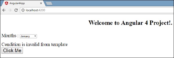
The variable isavailable is false so the condition2 template is printed. If you click the button, the respective template will be called. If you inspect the browser, you will see that you never get the span tag in the dom. The following example will help you understand the same.
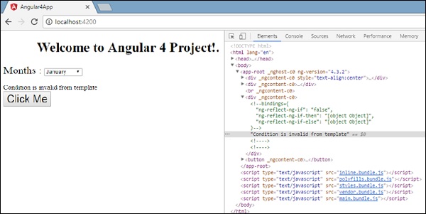
If you inspect the browser, you will see that the dom does not have the span tag. It has the Condition is invalid from template in the dom.
The following line of code in html will help us get the span tag in the dom.
<!--The content below is only a placeholder and can be replaced.-->
<div style = "text-align:center">
   <h1>
      Welcome to {{title}}.
   </h1>
</div>

<div> Months :
   <select (change) = "changemonths($event)" name = "month">
      <option *ngFor = "let i of months">{{i}}</option>
   </select>
</div>
<br/>

<div>
   <span *ngIf = "isavailable; else condition2">Condition is valid.</span>
   <ng-template #condition1>Condition is valid from template</ng-template>
   <ng-template #condition2>Condition is invalid from template</ng-template>
</div>

<button (click)="myClickFunction($event)">Click Me</button>
If we remove the then condition, we get the “Condition is valid” message in the browser and the span tag is also available in the dom. For example, in app.component.ts, we have made the isavailable variable as true.
Angular 4 - Directives
Directives in Angular is a js class, which is declared as @directive. We have 3 directives in Angular. The directives are listed below −
Component Directives
These form the main class having details of how the component should be processed, instantiated and used at runtime.
Structural Directives
A structure directive basically deals with manipulating the dom elements. Structural directives have a * sign before the directive. For example, *ngIf and *ngFor.
Attribute Directives
Attribute directives deal with changing the look and behavior of the dom element. You can create your own directives as shown below.
How to Create Custom Directives?
In this section, we will discuss about Custom Directives to be used in components. Custom directives are created by us and are not standard.
Let us see how to create the custom directive. We will create the directive using the command line. The command to create the directive using the command line is −
ng g directive nameofthedirective

e.g

ng g directive changeText
This is how it appears in the command line
C:\projectA4\Angular 4-app>ng g directive changeText
installing directive
   create src\app\change-text.directive.spec.ts
   create src\app\change-text.directive.ts
   update src\app\app.module.ts
The above files, i.e., change-text.directive.spec.ts and change-text.directive.ts get created and the app.module.ts file is updated.
app.module.ts
import { BrowserModule } from '@angular/platform-browser';
import { NgModule } from '@angular/core';
import { AppComponent } from './app.component';

import { NewCmpComponent } from './new-cmp/new-cmp.component';
import { ChangeTextDirective } from './change-text.directive';

@NgModule({
   declarations: [
      AppComponent,
      NewCmpComponent,
      ChangeTextDirective
   ],

   imports: [
      BrowserModule
   ],

   providers: [],
   bootstrap: [AppComponent]
})

export class AppModule { }
The ChangeTextDirective class is included in the declarations in the above file. The class is also imported from the file given below.
change-text. directive
import { Directive } from '@angular/core';
@Directive({
   selector: '[changeText]'
})

export class ChangeTextDirective {
   constructor() { }
}
The above file has a directive and it also has a selector property. Whatever we define in the selector, the same has to match in the view, where we assign the custom directive.
In the app.component.html view, let us add the directive as follows −
<div style="text-align:center">
   <span changeText >Welcome to {{title}}.</span>
</div>
We will write the changes in change-text.directive.ts file as follows −
change-text.directive.ts
import { Directive, ElementRef} from '@angular/core';
@Directive({
selector: '[changeText]'
})
export class ChangeTextDirective {
constructor(Element: ElementRef) {
console.log(Element);
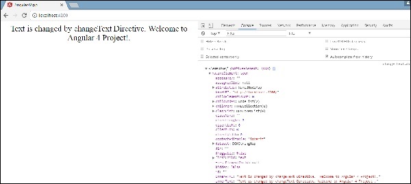
Element.nativeElement.innerText="Text is changed by changeText Directive. ";
}
}
In the above file, there is a class called ChangeTextDirective and a constructor, which takes the element of type ElementRef, which is mandatory. The element has all the details to which the Change Text directive is applied.
We have added the console.log element. The output of the same can be seen in the browser console. The text of the element is also changed as shown above.
Now, the browser will show the following.
Angular 4 - Pipes
In this chapter, we will discuss what are Pipes in Angular 4. Pipes were earlier called filters in Angular1 and called pipes in Angular 2 and 4.
The | character is used to transform data. Following is the syntax for the same
{{ Welcome to Angular 4 | lowercase}}
It takes integers, strings, arrays, and date as input separated with | to be converted in the format as required and display the same in the browser.
Let us consider a few examples using pipes.
Here, we want to display the text given to uppercase. This can be done using pipes as follows −
In the app.component.ts file, we have defined the title variable −
app.component.ts
import { Component } from '@angular/core';
@Component({
   selector: 'app-root',
   templateUrl: './app.component.html',
   styleUrls: ['./app.component.css']
})

export class AppComponent {
   title = 'Angular 4 Project!';
}
The following line of code goes into the app.component.html file.
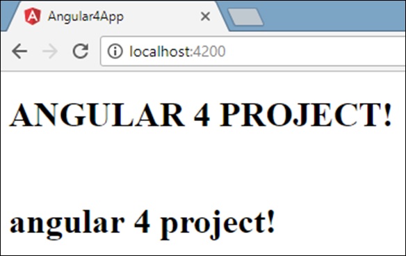
<b>{{title | uppercase}}</b><br/>
<b>{{title | lowercase}}</b>
The browser appears as shown in the following screenshot −
Angular 4 provides some built-in pipes. The pipes are listed below −
- Lowercasepipe
- Uppercasepipe
- Datepipe
- Currencypipe
- Jsonpipe
- Percentpipe
- Decimalpipe
- Slicepipe
We have already seen the lowercase and uppercase pipes. Let us now see how the other pipes work.
The following line of code will help us define the required variables in app.component.ts file −
import { Component } from '@angular/core';

@Component({
   selector: 'app-root',
   templateUrl: './app.component.html',
   styleUrls: ['./app.component.css']
})

export class AppComponent {
   title = 'Angular 4 Project!';
   todaydate = new Date();
   jsonval = {name:'Rox', age:'25', address:{a1:'Mumbai', a2:'Karnataka'}};
   months = ["Jan", "Feb", "Mar", "April", "May", "Jun",
             "July", "Aug", "Sept", "Oct", "Nov", "Dec"];
}
We will use the pipes in the app.component.html file.
<!--The content below is only a placeholder and can be replaced.-->
<div style = "width:100%;">
<div style = "width:40%;float:left;border:solid 1px black;">
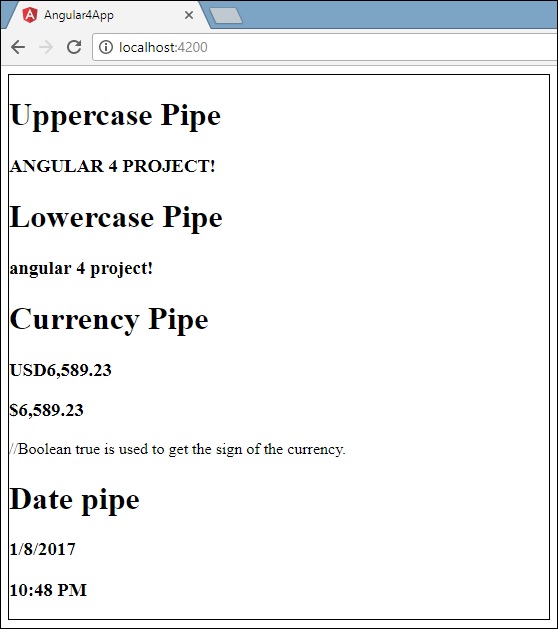
<h1>Uppercase Pipe</h1>
<b>{{title | uppercase}}</b><br/>
<h1>Lowercase Pipe</h1>
<b>{{title | lowercase}}</b>
<h1>Currency Pipe</h1>
<b>{{6589.23 | currency:"USD"}}</b><br/>
<b>{{6589.23 | currency:"USD":true}}</b> //Boolean true is used to get the sign of the currency.
<h1>Date pipe</h1>
<b>{{todaydate | date:'d/M/y'}}</b><br/>
<b>{{todaydate | date:'shortTime'}}</b>
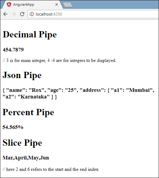
<h1>Decimal Pipe</h1>
<b>{{ 454.78787814 | number: '3.4-4' }}</b> // 3 is for main integer, 4 -4 are for integers to be displayed.
</div>
<div style = "width:40%;float:left;border:solid 1px black;">
<h1>Json Pipe</h1>
<b>{{ jsonval | json }}</b>
<h1>Percent Pipe</h1>
<b>{{00.54565 | percent}}</b>
<h1>Slice Pipe</h1>
<b>{{months | slice:2:6}}</b>
// here 2 and 6 refers to the start and the end index
</div>
</div>
The following screenshots show the output for each pipe −
How to Create a Custom Pipe?
To create a custom pipe, we have created a new ts file. Here, we want to create the sqrt custom pipe. We have given the same name to the file and it looks as follows −
app.sqrt.ts
import {Pipe, PipeTransform} from '@angular/core';
@Pipe ({
   name : 'sqrt'
})
export class SqrtPipe implements PipeTransform {
   transform(val : number) : number {
      return Math.sqrt(val);
   }
}
To create a custom pipe, we have to import Pipe and Pipe Transform from Angular/core. In the @Pipe directive, we have to give the name to our pipe, which will be used in our .html file. Since, we are creating the sqrt pipe, we will name it sqrt.
As we proceed further, we have to create the class and the class name is SqrtPipe. This class will implement the PipeTransform.
The transform method defined in the class will take argument as the number and will return the number after taking the square root.
Since we have created a new file, we need to add the same in app.module.ts. This is done as follows −
import { BrowserModule } from '@angular/platform-browser';
import { NgModule } from '@angular/core';
import { AppComponent } from './app.component';

import { NewCmpComponent } from './new-cmp/new-cmp.component';
import { ChangeTextDirective } from './change-text.directive';
import { SqrtPipe } from './app.sqrt';

@NgModule({
   declarations: [
      SqrtPipe,
      AppComponent,
      NewCmpComponent,
      ChangeTextDirective
   ],

   imports: [
      BrowserModule
   ],
   providers: [],
   bootstrap: [AppComponent]
})
export class AppModule { }
We have created the app.sqrt.ts class. We have to import the same in app.module.ts and specify the path of the file. It also has to be included in the declarations as shown above.
Let us now see the call made to the sqrt pipe in the app.component.html file.
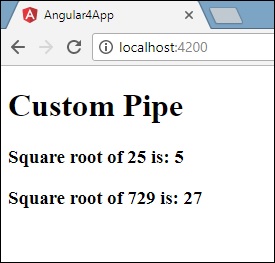
<h1>Custom Pipe</h1>
<b>Square root of 25 is: {{25 | sqrt}}</b>
<br/>
<b>Square root of 729 is: {{729 | sqrt}}</b>
The output looks as follows −
Angular 4 - Routing
Routing basically means navigating between pages. You have seen many sites with links that direct you to a new page. This can be achieved using routing. Here the pages that we are referring to will be in the form of components. We have already seen how to create a component. Let us now create a component and see how to use routing with it.
In the main parent component app.module.ts, we have to now include the router module as shown below −
import { BrowserModule } from '@angular/platform-browser';
import { NgModule } from '@angular/core';
import { RouterModule} from '@angular/router';

import { AppComponent } from './app.component';
import { NewCmpComponent } from './new-cmp/new-cmp.component';
import { ChangeTextDirective } from './change-text.directive';
import { SqrtPipe } from './app.sqrt';
@NgModule({
   declarations: [
      SqrtPipe,
      AppComponent,
      NewCmpComponent,
      ChangeTextDirective
   ],
   imports: [
      BrowserModule,
      RouterModule.forRoot([
         {
            path: 'new-cmp',
            component: NewCmpComponent
         }
      ])
   ],
   providers: [],
   bootstrap: [AppComponent]
})
export class AppModule { }
import { RouterModule} from '@angular/router'
Here, the RouterModule is imported from angular/router. The module is included in the imports as shown below −
RouterModule.forRoot([
   {
      path: 'new-cmp',
      component: NewCmpComponent
   }
])
RouterModule refers to the forRoot which takes an input as an array, which in turn has the object of the path and the component. Path is the name of the router and component is the name of the class, i.e., the component created.
Let us now see the component created file −
New-cmp.component.ts
import { Component, OnInit } from '@angular/core';

@Component({
   selector: 'app-new-cmp',
   templateUrl: './new-cmp.component.html',
   styleUrls: ['./new-cmp.component.css']
})

export class NewCmpComponent implements OnInit {
   newcomponent = "Entered in new component created";
   constructor() {}
   ngOnInit() { }
}
The highlighted class is mentioned in the imports of the main module.
New-cmp.component.html
<p>
   {{newcomponent}}
</p>

<p>
   new-cmp works!
</p>
Now, we need the above content from the html file to be displayed whenever required or clicked from the main module. For this, we need to add the router details in the app.component.html.
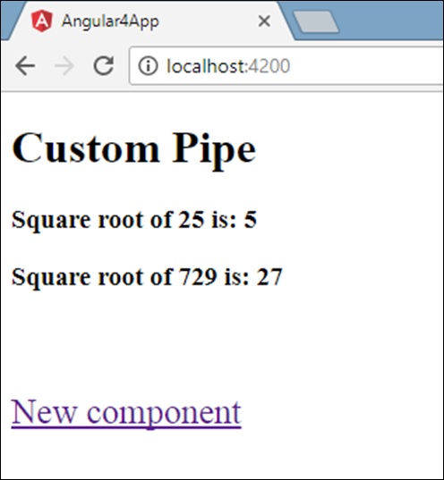
<h1>Custom Pipe</h1>
<b>Square root of 25 is: {{25 | sqrt}}</b><br/>
<b>Square root of 729 is: {{729 | sqrt}}</b>

<br />
<br />
<br />
<a routerLink = "new-cmp">New component</a>

<br />
<br/>
<router-outlet></router-outlet>
In the above code, we have created the anchor link tag and given routerLink as “new-cmp”. This is referred in app.module.ts as the path.
When a user clicks new component, the page should display the content. For this, we need the following tag - <router-outlet> </router-outlet>.
The above tag ensures that the content in the new-cmp.component.html will be displayed on the page when a user clicks new component.
Let us now see how the output is displayed on the browser.
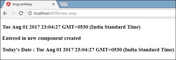
When a user clicks New component, you will see the following in the browser.
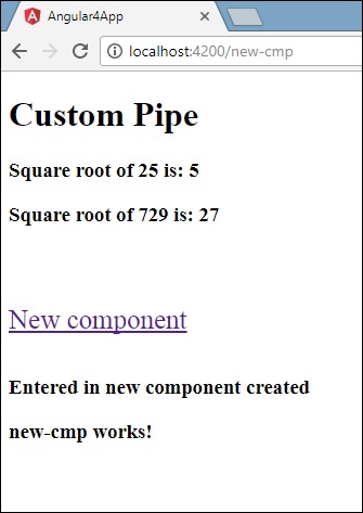
The url contains https://localhost:4200/new-cmp. Here, the new-cmp gets appended to the original url, which is the path given in the app.module.ts and the router-link in the app.component.html.
When a user clicks New component, the page is not refreshed and the contents are shown to the user without any reloading. Only a particular piece of the site code will be reloaded when clicked. This feature helps when we have heavy content on the page and needs to be loaded based on the user interaction. The feature also gives a good user experience as the page is not reloaded.
Angular 4 - Services
In this chapter, we will discuss the services in Angular 4.
We might come across a situation where we need some code to be used everywhere on the page. It can be for data connection that needs to be shared across components, etc. Services help us achieve that. With services, we can access methods and properties across other components in the entire project.
To create a service, we need to make use of the command line. The command for the same is −
C:\projectA4\Angular 4-app>ng g service myservice
installing service
   create src\app\myservice.service.spec.ts
   create src\app\myservice.service.ts
   WARNING Service is generated but not provided, it must be provided to be used

   C:\projectA4\Angular 4-app>
The files are created in the app folder as follows −
Following are the files created at the bottom - myservice.service.specs.ts and myservice.service.ts.
myservice.service.ts
import { Injectable } from '@angular/core';

@Injectable()
export class MyserviceService {
   constructor() { }
}
Here, the Injectable module is imported from the @angular/core. It contains the @Injectable method and a class called MyserviceService. We will create our service function in this class.
Before creating a new service, we need to include the service created in the main parent app.module.ts.
import { BrowserModule } from '@angular/platform-browser';
import { NgModule } from '@angular/core';
import { RouterModule} from '@angular/router';
import { AppComponent } from './app.component';

import { MyserviceService } from './myservice.service';
import { NewCmpComponent } from './new-cmp/new-cmp.component';
import { ChangeTextDirective } from './change-text.directive';
import { SqrtPipe } from './app.sqrt';

@NgModule({
   declarations: [
      SqrtPipe,
      AppComponent,
      NewCmpComponent,
      ChangeTextDirective
   ],
   imports: [
      BrowserModule,
      RouterModule.forRoot([
         {
            path: 'new-cmp',
            component: NewCmpComponent
         }
      ])
   ],
   providers: [MyserviceService],
   bootstrap: [AppComponent]
})

export class AppModule { }
We have imported the Service with the class name and the same class is used in the providers. Let us now switch back to the service class and create a service function.
In the service class, we will create a function which will display today’s date. We can use the same function in the main parent component app.component.ts and also in the new component new-cmp.component.ts that we created in the previous chapter.
Let us now see how the function looks in the service and how to use it in components.
import { Injectable } from '@angular/core';
@Injectable()
export class MyserviceService {
   constructor() { }
   showTodayDate() {
      let ndate = new Date();
      return ndate;
   }
}
In the above service file, we have created a function showTodayDate. Now we will return the new Date () created. Let us see how we can access this function in the component class.
app.component.ts
import { Component } from '@angular/core';
import { MyserviceService } from './myservice.service';

@Component({
   selector: 'app-root',
   templateUrl: './app.component.html',
   styleUrls: ['./app.component.css']
})

export class AppComponent {
   title = 'Angular 4 Project!';
   todaydate;
   constructor(private myservice: MyserviceService) {}
   ngOnInit() {
      this.todaydate = this.myservice.showTodayDate();
   }
}
The ngOnInit function gets called by default in any component created. The date is fetched from the service as shown above. To fetch more details of the service, we need to first include the service in the component ts file.
We will display the date in the .html file as shown below −
{{todaydate}}
<app-new-cmp></app-new-cmp>
// data to be displayed to user from the new component class.
Let us now see how to use the service in the new component created.
import { Component, OnInit } from '@angular/core';
import { MyserviceService } from './../myservice.service';

@Component({
   selector: 'app-new-cmp',
   templateUrl: './new-cmp.component.html',
   styleUrls: ['./new-cmp.component.css']
})

export class NewCmpComponent implements OnInit {
   todaydate;
   newcomponent = "Entered in new component created";
   constructor(private myservice: MyserviceService) {}

   ngOnInit() {
      this.todaydate = this.myservice.showTodayDate();
   }
}
In the new component that we have created, we need to first import the service that we want and access the methods and properties of the same. Please see the code highlighted. The todaydate is displayed in the component html as follows −
<p>
   {{newcomponent}}
</p>
<p>
   Today's Date : {{todaydate}}
</p>
The selector of the new component is used in the app.component.html file. The contents from the above html file will be displayed in the browser as shown below −
If you change the property of the service in any component, the same is changed in other components too. Let us now see how this works.
We will define one variable in the service and use it in the parent and the new component. We will again change the property in the parent component and will see if the same is changed in the new component or not.
In myservice.service.ts, we have created a property and used the same in other parent and new component.
import { Injectable } from '@angular/core';

@Injectable()
export class MyserviceService {
   serviceproperty = "Service Created";
   constructor() { }
   showTodayDate() {
      let ndate = new Date();
      return ndate;
   }
}
Let us now use the serviceproperty variable in other components. In app.component.ts, we are accessing the variable as follows −
import { Component } from '@angular/core';
import { MyserviceService } from './myservice.service';
@Component({
   selector: 'app-root',
   templateUrl: './app.component.html',
   styleUrls: ['./app.component.css']
})

export class AppComponent {
   title = 'Angular 4 Project!';
   todaydate;
   componentproperty;
   constructor(private myservice: MyserviceService) {}
   ngOnInit() {
      this.todaydate = this.myservice.showTodayDate();
      console.log(this.myservice.serviceproperty);
      this.myservice.serviceproperty = "component created"; // value is changed.
      this.componentproperty = this.myservice.serviceproperty;
   }
}
We will now fetch the variable and work on the console.log. In the next line, we will change the value of the variable to “component created”. We will do the same in new-cmp.component.ts.
import { Component, OnInit } from '@angular/core';
import { MyserviceService } from './../myservice.service';

@Component({
   selector: 'app-new-cmp',
   templateUrl: './new-cmp.component.html',
   styleUrls: ['./new-cmp.component.css']
})

export class NewCmpComponent implements OnInit {
   todaydate;
   newcomponentproperty;
   newcomponent = "Entered in newcomponent";
   constructor(private myservice: MyserviceService) {}
   ngOnInit() {
      this.todaydate = this.myservice.showTodayDate();
      this.newcomponentproperty = this.myservice.serviceproperty;
   }
}
In the above component, we are not changing anything but directly assigning the property to the component property.
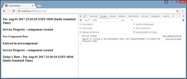
Now when you execute it in the browser, the service property will be changed since the value of it is changed in app.component.ts and the same will be displayed for the new-cmp.component.ts.
Also check the value in the console before it is changed.
Angular 4 - Http Service
Http Service will help us fetch external data, post to it, etc. We need to import the http module to make use of the http service. Let us consider an example to understand how to make use of the http service.
To start using the http service, we need to import the module in app.module.ts as shown below −
import { BrowserModule } from '@angular/platform-browser';
import { NgModule } from '@angular/core';
import { BrowserAnimationsModule } from '@angular/platform-browser/animations';
import { HttpModule } from '@angular/http';
import { AppComponent } from './app.component';

@NgModule({
   declarations: [
      AppComponent
   ],
   imports: [
      BrowserModule,
      BrowserAnimationsModule,
      HttpModule
   ],
   providers: [],
   bootstrap: [AppComponent]
})
export class AppModule { }
If you see the highlighted code, we have imported the HttpModule from @angular/http and the same is also added in the imports array.
Let us now use the http service in the app.component.ts.
import { Component } from '@angular/core';
import { Http } from '@angular/http';
import 'rxjs/add/operator/map';

@Component({
   selector: 'app-root',
   templateUrl: './app.component.html',
   styleUrls: ['./app.component.css']
})

export class AppComponent {
   constructor(private http: Http) { }
   ngOnInit() {
      this.http.get("https://jsonplaceholder.typicode.com/users").
      map((response) ⇒ response.json()).
      subscribe((data) ⇒ console.log(data))
   }
}
Let us understand the code highlighted above. We need to import http to make use of the service, which is done as follows −
import { Http } from '@angular/http';
In the class AppComponent, a constructor is created and the private variable http of type Http. To fetch the data, we need to use the get API available with http as follows
this.http.get();
It takes the url to be fetched as the parameter as shown in the code.
We will use the test url - https://jsonplaceholder.typicode.com/users to fetch the json data. Two operations are performed on the fetched url data map and subscribe. The Map method helps to convert the data to json format. To use the map, we need to import the same as shown below −
import 'rxjs/add/operator/map';
Once the map is done, the subscribe will log the output in the console as shown in the browser −
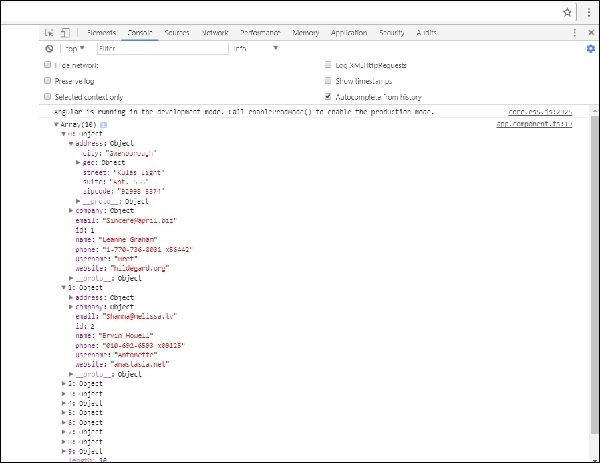
If you see, the json objects are displayed in the console. The objects can be displayed in the browser too.
For the objects to be displayed in the browser, update the codes in app.component.html and app.component.ts as follows −
import { Component } from '@angular/core';
import { Http } from '@angular/http';
import 'rxjs/add/operator/map';

@Component({
   selector: 'app-root',
   templateUrl: './app.component.html',
   styleUrls: ['./app.component.css']
})
export class AppComponent {
   constructor(private http: Http) { }
   httpdata;
   ngOnInit() {
      this.http.get("https://jsonplaceholder.typicode.com/users").
      map(
         (response) ⇒ response.json()
      ).
      subscribe(
         (data) ⇒ {this.displaydata(data);}
      )
   }
   displaydata(data) {this.httpdata = data;}
}
In app.component.ts, using the subscribe method we will call the display data method and pass the data fetched as the parameter to it.
In the display data method, we will store the data in a variable httpdata. The data is displayed in the browser using for over this httpdata variable, which is done in the app.component.html file.
<ul *ngFor = "let data of httpdata">
   <li>Name : {{data.name}} Address: {{data.address.city}}</li>
</ul>
The json object is as follows −
{
   "id": 1,
   "name": "Leanne Graham",
   "username": "Bret",
   "email": "[email protected]",

   "address": {
      "street": "Kulas Light",
      "suite": "Apt. 556",
      "city": "Gwenborough",
      "zipcode": "92998-3874",
      "geo": {
         "lat": "-37.3159",
         "lng": "81.1496"
      }
   },

   "phone": "1-770-736-8031 x56442",
   "website": "hildegard.org",
   "company": {
      "name": "Romaguera-Crona",
      "catchPhrase": "Multi-layered client-server neural-net",
      "bs": "harness real-time e-markets"
   }
}
The object has properties such as id, name, username, email, and address that internally has street, city, etc. and other details related to phone, website, and company. Using the for loop, we will display the name and the city details in the browser as shown in the app.component.html file.
This is how the display is shown in the browser −

Let us now add the search parameter, which will filter based on specific data. We need to fetch the data based on the search param passed.
Following are the changes done in app.component.html and app.component.ts files −
app.component.ts
import { Component } from '@angular/core';
import { Http } from '@angular/http';
import 'rxjs/add/operator/map';

@Component({
   selector: 'app-root',
   templateUrl: './app.component.html',
   styleUrls: ['./app.component.css']
})
export class AppComponent {
   title = 'app';
   searchparam = 2;
   jsondata;
   name;
   constructor(private http: Http) { }
   ngOnInit() {
      this.http.get("https://jsonplaceholder.typicode.com/users?id="+this.searchparam).
      map(
         (response) ⇒ response.json()
      ).
      subscribe((data) ⇒ this.converttoarray(data))
   }
   converttoarray(data) {
      console.log(data);
      this.name = data[0].name;
   }
}
For the get api, we will add the search param id = this.searchparam. The searchparam is equal to 2. We need the details of id=2 from the json file.
app.component.html
{{name}}
This is how the browser is displayed −
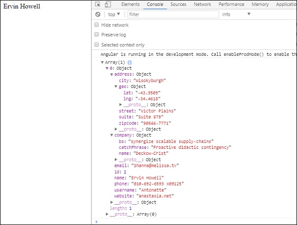
We have consoled the data in the browser, which is received from the http. The same is displayed in the browser console. The name from the json with id=2 is displayed in the browser.
Angular 4 - Forms
In this chapter, we will see how forms are used in Angular 4. We will discuss two ways of working with forms - template driven form and model driven forms.
Template Driven Form
With a template driven form, most of the work is done in the template; and with the model driven form, most of the work is done in the component class.
Let us now consider working on the Template driven form. We will create a simple login form and add the email id, password and submit the button in the form. To start with, we need to import to FormsModule from @angular/core which is done in app.module.ts as follows −
import { BrowserModule } from '@angular/platform-browser';
import { NgModule } from '@angular/core';
import { RouterModule} from '@angular/router';

import { HttpModule } from '@angular/http';
import { FormsModule } from '@angular/forms';
import { AppComponent } from './app.component';

import { MyserviceService } from './myservice.service';
import { NewCmpComponent } from './new-cmp/new-cmp.component';
import { ChangeTextDirective } from './change-text.directive';
import { SqrtPipe } from './app.sqrt';

@NgModule({
   declarations: [
      SqrtPipe,
      AppComponent,
      NewCmpComponent,
      ChangeTextDirective
   ],
   imports: [
      BrowserModule,
      HttpModule,
      FormsModule,
      RouterModule.forRoot([
         {path: 'new-cmp',component: NewCmpComponent}
      ])
   ],
   providers: [MyserviceService],
   bootstrap: [AppComponent]
})

export class AppModule { }
So in app.module.ts, we have imported the FormsModule and the same is added in the imports array as shown in the highlighted code.
Let us now create our form in the app.component.html file.
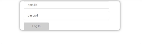
<form #userlogin = "ngForm" (ngSubmit) = "onClickSubmit(userlogin.value)" >
   <input type = "text" name = "emailid" placeholder = "emailid" ngModel>
   <br/>
   <input type = "password" name = "passwd" placeholder = "passwd" ngModel>
   <br/>
   <input type = "submit" value = "submit">
</form>
We have created a simple form with input tags having email id, password and the submit button. We have assigned type, name, and placeholder to it.
In template driven forms, we need to create the model form controls by adding the ngModel directive and the name attribute. Thus, wherever we want Angular to access our data from forms, add ngModel to that tag as shown above. Now, if we have to read the emailid and passwd, we need to add the ngModel across it.
If you see, we have also added the ngForm to the #userlogin. The ngForm directive needs to be added to the form template that we have created. We have also added function onClickSubmit and assigned userlogin.value to it.
Let us now create the function in the app.component.ts and fetch the values entered in the form.
import { Component } from '@angular/core';
import { MyserviceService } from './myservice.service';

@Component({
   selector: 'app-root',
   templateUrl: './app.component.html',
   styleUrls: ['./app.component.css']
})

export class AppComponent {
   title = 'Angular 4 Project!';
   todaydate;
   componentproperty;
   constructor(private myservice: MyserviceService) { }
   ngOnInit() {
      this.todaydate = this.myservice.showTodayDate();
   }
   onClickSubmit(data) {
      alert("Entered Email id : " + data.emailid);
   }
}
In the above app.component.ts file, we have defined the function onClickSubmit. When you click on the form submit button, the control will come to the above function.
This is how the browser is displayed −
The form looks like as shown below. Let us enter the data in it and in the submit function, the email id is already entered.
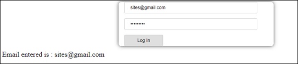
The email id is displayed at the bottom as shown in the above screenshot.
Model Driven Form
In the model driven form, we need to import the ReactiveFormsModule from @angular/forms and use the same in the imports array.
There is a change which goes in app.module.ts.
import { BrowserModule } from '@angular/platform-browser';
import { NgModule } from '@angular/core';
import { RouterModule} from '@angular/router';

import { HttpModule } from '@angular/http';
import { ReactiveFormsModule } from '@angular/forms';
import { AppComponent } from './app.component';

import { MyserviceService } from './myservice.service';
import { NewCmpComponent } from './new-cmp/new-cmp.component';
import { ChangeTextDirective } from './change-text.directive';
import { SqrtPipe } from './app.sqrt';

@NgModule({
   declarations: [
      SqrtPipe,
      AppComponent,
      NewCmpComponent,
      ChangeTextDirective
   ],
   imports: [
      BrowserModule,
      HttpModule,
      ReactiveFormsModule,
      RouterModule.forRoot([
         {
            path: 'new-cmp',
            component: NewCmpComponent
         }
      ])
   ],
   providers: [MyserviceService],
   bootstrap: [AppComponent]
})
export class AppModule { }
In app.component.ts, we need to import a few modules for the model driven form. For example, import { FormGroup, FormControl } from '@angular/forms'.
import { Component } from '@angular/core';
import { MyserviceService } from './myservice.service';
import { FormGroup, FormControl } from '@angular/forms';

@Component({
   selector: 'app-root',
   templateUrl: './app.component.html',
   styleUrls: ['./app.component.css']
})
export class AppComponent {
   title = 'Angular 4 Project!';
   todaydate;
   componentproperty;
   emailid;
   formdata;
   constructor(private myservice: MyserviceService) { }
   ngOnInit() {
      this.todaydate = this.myservice.showTodayDate();
      this.formdata = new FormGroup({
         emailid: new FormControl("[email protected]"),
         passwd: new FormControl("abcd1234")
      });
   }
   onClickSubmit(data) {this.emailid = data.emailid;}
}
The variable formdata is initialized at the start of the class and the same is initialized with FormGroup as shown above. The variables emailid and passwd are initialized with default values to be displayed in the form. You can keep it blank in case you want to.
This is how the values will be seen in the form UI.
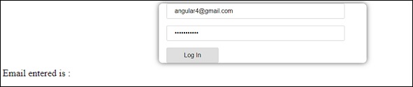
We have used formdata to initialize the form values; we need to use the same in the form UI app.component.html.
<div>
   <form [formGroup]="formdata" (ngSubmit) = "onClickSubmit(formdata.value)" >
      <input type="text" class="fortextbox" name="emailid" placeholder="disabled"
      formControlName="emailid">
      <br/>

      <input type="password" class="fortextbox" name="passwd"
      placeholder="disabled" formControlName="passwd">
      <br/>

      <input type="submit" class="forsubmit" value="Log In">
   </form>
</div>
<p>
   Email entered is : {{emailid}}
</p>
In the .html file, we have used formGroup in square bracket for the form; for example, [formGroup]=”formdata”. On submit, the function is called onClickSubmit for which formdata.value is passed.
The input tag formControlName is used. It is given a value that we have used in the app.component.ts file.
On clicking submit, the control will pass to the function onClickSubmit, which is defined in the app.component.ts file.
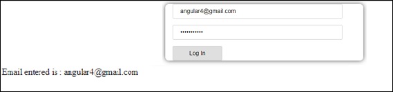
On clicking Login, the value will be displayed as shown in the above screenshot.
Form Validation
Let us now discuss form validation using model driven form. You can use the built-in form validation or also use the custom validation approach. We will use both the approaches in the form. We will continue with the same example that we created in one of our previous sections. With Angular 4, we need to import Validators from @angular/forms as shown below −
import { FormGroup, FormControl, Validators} from '@angular/forms'
Angular has built-in validators such as mandatory field, minlength, maxlength, and pattern. These are to be accessed using the Validators module.
You can just add validators or an array of validators required to tell Angular if a particular field is mandatory.
Let us now try the same on one of the input textboxes, i.e., email id. For the email id, we have added the following validation parameters −
- Required
- Pattern matching
This is how a code undergoes validation in app.component.ts.
import { Component } from '@angular/core';
import { FormGroup, FormControl, Validators} from '@angular/forms';

@Component({
   selector: 'app-root',
   templateUrl: './app.component.html',
   styleUrls: ['./app.component.css']
})

export class AppComponent {
   title = 'Angular 4 Project!';
   todaydate;
   componentproperty;
   emailid;
   formdata;
   ngOnInit() {
      this.formdata = new FormGroup({
         emailid: new FormControl("", Validators.compose([
            Validators.required,
            Validators.pattern("[^ @]*@[^ @]*")
         ])),
         passwd: new FormControl("")
      });
   }
   onClickSubmit(data) {this.emailid = data.emailid;}
}
In Validators.compose, you can add the list of things you want to validate on the input field. Right now, we have added the required and the pattern matching parameters to take only valid email.
In the app.component.html, the submit button is disabled if any of the form inputs are not valid. This is done as follows −
<div>
   <form [formGroup] = "formdata" (ngSubmit) = "onClickSubmit(formdata.value)" >
      <input type = "text" class = "fortextbox" name = "emailid" placeholder = "emailid"
         formControlName = "emailid">
      <br/>
      <input type = "password" class = "fortextbox" name = "passwd"
         placeholder = "passwd" formControlName = "passwd">
      <br/>
      <input type = "submit" [disabled] = "!formdata.valid" class = "forsubmit"
         value = "Log In">
   </form>
</div>

<p>
   Email entered is : {{emailid}}
</p>
For the submit button, we have added disabled in the square bracket, which is given value - !formdata.valid. Thus, if the formdata.valid is not valid, the button will remain disabled and the user will not be able to submit it.
Let us see the how this works in the browser −
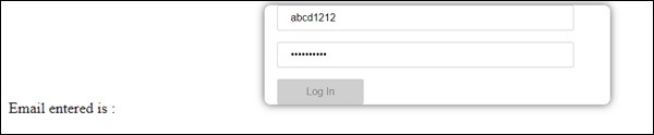
In the above case, the email id entered is invalid, hence the login button is disabled. Let us now try entering the valid email id and see the difference.
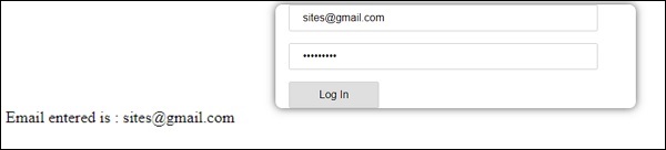
Now, the email id entered is valid. Thus, we can see the login button is enabled and the user will be able to submit it. With this, the email id entered is displayed at the bottom.
Let us now try custom validation with the same form. For custom validation, we can define our own custom function and add the required details in it. We will now see an example for the same.
import { Component } from '@angular/core';
import { FormGroup, FormControl, Validators} from '@angular/forms';

@Component({
   selector: 'app-root',
   templateUrl: './app.component.html',
   styleUrls: ['./app.component.css']
})

export class AppComponent {
   title = 'Angular 4 Project!';
   todaydate;
   componentproperty;
   emailid;
   formdata;
   ngOnInit() {
      this.formdata = new FormGroup({
         emailid: new FormControl("", Validators.compose([
            Validators.required,
            Validators.pattern("[^ @]*@[^ @]*")
         ])),
         passwd: new FormControl("", this.passwordvalidation)
      });
   }
   passwordvalidation(formcontrol) {
      if (formcontrol.value.length <'; 5) {
         return {"passwd" : true};
      }
   }
   onClickSubmit(data) {this.emailid = data.emailid;}
}
In the above example, we have created a function password validation and the same is used in a previous section in the formcontrol - passwd: new FormControl("", this.passwordvalidation).
In the function that we have created, we will check if the length of the characters entered is appropriate. If the characters are less than five, it will return with the passwd true as shown above - return {"passwd" : true};. If the characters are more than five, it will consider it as valid and the login will be enabled.
Let us now see how this is displayed in the browser −
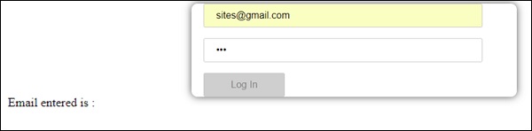
We have entered only three characters in the password and the login is disabled. To enable login, we need more than five characters. Let us now enter a valid length of characters and check.
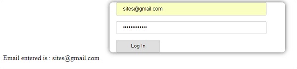
The login is enabled as both the email id and the password are valid. The email is displayed at the bottom as we log in.
Angular 4 - Animations
Animations add a lot of interaction between the html elements. Animation was also available with Angular2. The difference with Angular 4 is that animation is no more a part of the @angular/core library, but is a separate package that needs to be imported in app.module.ts.
To start with, we need to import the library as follows −
import { BrowserAnimationsModule } from '@angular/platform-browser/animations';
The BrowserAnimationsModule needs to be added to the import array in app.module.ts as shown below −
app.module.ts
import { BrowserModule } from '@angular/platform-browser';
import { NgModule } from '@angular/core';

import { BrowserAnimationsModule } from '@angular/platform-browser/animations';
import { AppComponent } from './app.component';

@NgModule({
   declarations: [
      AppComponent
   ],
   imports: [
      BrowserModule,
      BrowserAnimationsModule
   ],
   providers: [],
   bootstrap: [AppComponent]
})
export class AppModule { }
In app.component.html, we have added the html elements, which are to be animated.
<div>
   <button (click)="animate()">Click Me</button>
   <div [@myanimation] = "state" class="rotate">
      <img src="assets/images/img.png" width="100" height="100">
   </div>
</div>
For the main div, we have added a button and a div with an image. There is a click event for which the animate function is called. And for the div, the @myanimation directive is added and given the value as state.
Let us now see the app.component.ts where the animation is defined.
import { Component } from '@angular/core';
import { trigger, state, style, transition, animate } from '@angular/animations';

@Component({
   selector: 'app-root',
   templateUrl: './app.component.html',
   styleUrls: ['./app.component.css'],
   styles:[`
      div{
         margin: 0 auto;
         text-align: center;
         width:200px;
      }
      .rotate{
         width:100px;
         height:100px;
         border:solid 1px red;
      }
   `],
   animations: [
      trigger('myanimation',[
         state('smaller',style({
            transform : 'translateY(100px)'
         })),
         state('larger',style({
            transform : 'translateY(0px)'
         })),
         transition('smaller <=> larger',animate('300ms ease-in'))
      ])
   ]
})

export class AppComponent {
   state: string = "smaller";
   animate() {
      this.state= this.state == 'larger' ? 'smaller' : 'larger';
   }
}
We have to import the animation function that is to be used in the .ts file as shown above.
import { trigger, state, style, transition, animate } from '@angular/animations';
Here we have imported trigger, state, style, transition, and animate from @angular/animations.
Now, we will add the animations property to the @Component () decorator −
animations: [
   trigger('myanimation',[
      state('smaller',style({
         transform : 'translateY(100px)'
      })),
      state('larger',style({
         transform : 'translateY(0px)'
      })),
      transition('smaller <=> larger',animate('300ms ease-in'))
   ])
]
Trigger defines the start of the animation. The first param to it is the name of the animation to be given to the html tag to which the animation needs to be applied. The second param are the functions we have imported - state, transition, etc.
The state function involves the animation steps, which the element will transition between. Right now we have defined two states, smaller and larger. For smaller state, we have given the style transform:translateY(100px) and transform:translateY(100px).
Transition function adds animation to the html element. The first argument takes the states, i.e., start and end; the second argument accepts the animate function. The animate function allows you to define the length, delay, and easing of a transition.
Let us now see the .html file to see how the transition function works
<div>
   <button (click)="animate()">Click Me</button>
   <div [@myanimation] = "state" class="rotate">
      <img src="assets/images/img.png" width="100" height="100">
   </div>
</div>
There is a style property added in the @component directive, which centrally aligns the div. Let us consider the following example to understand the same −
styles:[`
   div{
      margin: 0 auto;
      text-align: center;
      width:200px;
   }
   .rotate{
      width:100px;
      height:100px;
      border:solid 1px red;
   }
`],
Here, a special character [``] is used to add styles to the html element, if any. For the div, we have given the animation name defined in the app.component.ts file.
On the click of a button it calls the animate function, which is defined in the app.component.ts file as follows −
export class AppComponent {
   state: string = "smaller";
   animate() {
      this.state= this.state == ‘larger’? 'smaller' : 'larger';
   }
}
The state variable is defined and is given the default value as smaller. The animate function changes the state on click. If the state is larger, it will convert to smaller; and if smaller, it will convert to larger.
This is how the output in the browser (https://localhost:4200/) will look like −
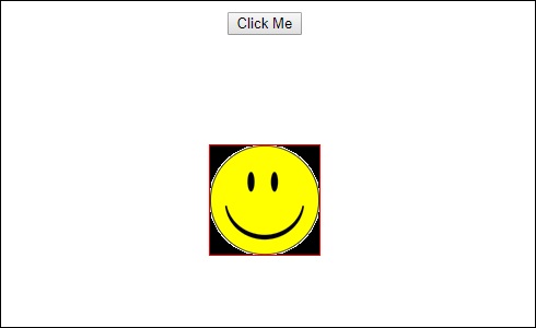
Upon clicking the Click Me button, the position of the image is changed as shown in the following screenshot −
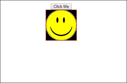
The transform function is applied in the y direction, which is changed from 0 to 100px when the Click Me button is clicked. The image is stored in the assets/images folder.
Angular 4 - Materials
Materials offer a lot of built-in modules for your project. Features such as autocomplete, datepicker, slider, menus, grids, and toolbar are available for use with materials in Angular 4.
To use materials, we need to import the package. Angular 2 also has all the above features but they are available as part of the @angular/core module. Angular 4 has come up with a separate module @angular/materials.. This helps the user to import the required materials.
To start using materials, you need to install two packages - materials and cdk. Material components depend on the animation module for advanced features, hence you need the animation package for the same, i.e., @angular/animations. The package has already been updated in the previous chapter.
npm install --save @angular/material @angular/cdk
Let us now see the package.json. @angular/material and @angular/cdk are installed.
{
   "name": "angularstart",
   "version": "0.0.0",
   "license": "MIT",
   "scripts": {
      "ng": "ng",
      "start": "ng serve",
      "build": "ng build",
      "test": "ng test",
      "lint": "ng lint",
      "e2e": "ng e2e"
   },

   "private": true,

   "dependencies": {
      "@angular/animations": "^4.0.0",
      "@angular/cdk": "^2.0.0-beta.8",
      "@angular/common": "^4.0.0",
      "@angular/compiler": "^4.0.0",
      "@angular/core": "^4.0.0",
      "@angular/forms": "^4.0.0",

      "@angular/http": "^4.0.0",
      "@angular/material": "^2.0.0-beta.8",
      "@angular/platform-browser": "^4.0.0",
      "@angular/platform-browser-dynamic": "^4.0.0",
      "@angular/router": "^4.0.0",
      "core-js": "^2.4.1",
      "rxjs": "^5.1.0",
      "zone.js": "^0.8.4"
   },

   "devDependencies": {
      "@angular/cli": "1.2.0",
      "@angular/compiler-cli": "^4.0.0",
      "@angular/language-service": "^4.0.0",
      "@types/jasmine": "~2.5.53",
      "@types/jasminewd2": "~2.0.2",
      "@types/node": "~6.0.60",
      "codelyzer": "~3.0.1",
      "jasmine-core": "~2.6.2",
      "jasmine-spec-reporter": "~4.1.0",

      "karma": "~1.7.0",
      "karma-chrome-launcher": "~2.1.1",
      "karma-cli": "~1.0.1",
      "karma-coverage-istanbul-reporter": "^1.2.1",
      "karma-jasmine": "~1.1.0",
      "karma-jasmine-html-reporter": "^0.2.2",

      "protractor": "~5.1.2",
      "ts-node": "~3.0.4",
      "tslint": "~5.3.2",
      "typescript": "~2.3.3"
   }
}
We have highlighted the packages that are installed to work with materials.
We will now import the modules in the parent module - app.module.ts as shown below.
import { BrowserModule } from '@angular/platform-browser';
import { NgModule } from '@angular/core';

import { BrowserAnimationsModule } from '@angular/platform-browser/animations';
import { MdButtonModule, MdMenuModule, MdSidenavModule } from '@angular/material';

import { FormsModule } from '@angular/forms';
import { AppComponent } from './app.component';

@NgModule({
   declarations: [
      AppComponent
   ],
   imports: [
      BrowserModule,
      BrowserAnimationsModule,
      MdButtonModule,
      MdMenuModule,
      FormsModule,
      MdSidenavModule
   ],
   providers: [],
   bootstrap: [AppComponent]
})
export class AppModule { }
In the above file, we have imported the following modules from @angular/materials.
import { MdButtonModule, MdMenuModule, MdSidenavModule } from '@angular/material';
And the same is used in the imports array as shown below −
imports: [
   BrowserModule,
   BrowserAnimationsModule,
   MdButtonModule,
   MdMenuModule,
   FormsModule,
   MdSidenavModule
]
The app.component.ts is as shown below −
import { Component } from '@angular/core';

@Component({
   selector: 'app-root',
   templateUrl: './app.component.html',
   styleUrls: ['./app.component.css']
})

export class AppComponent {
   myData: Array<any>;
   constructor() {}
}
Let us now add the material in app.component.html.
<button md-button [mdMenuTriggerFor]="menu">Menu</button>
<md-menu #menu="mdMenu">
   <button md-menu-item>
      File
   </button>
   <button md-menu-item>
      Save As
   </button>
</md-menu>

<md-sidenav-container class="example-container">
   <md-sidenav #sidenav class="example-sidenav">
      Angular 4
   </md-sidenav>

   <div class="example-sidenav-content">
      <button type="button" md-button  (click)="sidenav.open()">
         Open sidenav
      </button>
   </div>
</md-sidenav-container>
In the above file, we have added Menu and SideNav.
Menu
To add menu, <md-menu></md-menu> is used. The file and Save As items are added to the button under md-menu. There is a main button added Menu. The reference of the same is given the <md-menu> by using [mdMenuTriggerFor]=”menu” and using the menu with # in <md-menu>.
SideNav
To add sidenav, we need <md-sidenav-container></md-sidenav-container>. <md-sidenav></md-sidenav> is added as a child to the container. There is another div added, which triggers the sidenav by using (click)=”sidenav.open()”. Following is the display of the menu and the sidenav in the browser −
Upon clicking opensidenav, it shows the side bar as shown below −
Upon clicking Menu, you will get two items File and Save As as shown below −
Let us now add a datepicker using materials. To add a datepicker, we need to import the modules required to show the datepicker.
In app.module.ts, we have imported the following module as shown below for datepicker.
import { BrowserModule } from '@angular/platform-browser';
import { NgModule } from '@angular/core';
import { BrowserAnimationsModule } from '@angular/platform-browser/animations';

import { MdDatepickerModule, MdInputModule, MdNativeDateModule } from '@angular/material';
import { FormsModule } from '@angular/forms';
import { AppComponent } from './app.component';

@NgModule({
   declarations: [
      AppComponent
   ],
   imports: [
      BrowserModule,
      BrowserAnimationsModule,
      FormsModule,
      MdDatepickerModule,
      MdInputModule,
      MdNativeDateModule
   ],
   providers: [],
   bootstrap: [AppComponent]
})
export class AppModule { }
Here, we have imported modules such as MdDatepickerModule, MdInputModule, and MdNativeDateModule.
Now, the app.component.ts is as shown below −
import { Component } from '@angular/core';
@Component({
   selector: 'app-root',
   templateUrl: './app.component.html',
   styleUrls: ['./app.component.css']
})

export class AppComponent {
   myData: Array<any>;
   constructor() {}
}
The app.component.html is as shown below −
<md-input-container>
   <input mdInput [mdDatepicker]="picker" placeholder="disabled">
   <button mdSuffix [mdDatepickerToggle]="picker"></button>
</md-input-container>

<md-datepicker #picker></md-datepicker>
This is how the datepicker is displayed in the browser −
Angular 4 - CLI
Angular CLI makes it easy to start with any Angular project. Angular CLI comes with commands that help us create and start on our project very fast. Let us now go through the commands available to create a project, a component and services, change the port, etc.
To work with Angular CLI, we need to have it installed on our system. Let us use the following command for the same −
npm install -g @angular/cli
To create a new project, we can run the following command in the command line and the project will be created.
ng new PROJECT-NAME
cd PROJECT-NAME
ng serve //
ng serve // will compile and you can see the output of your project in the browser −
https://localhost:4200/
4200 is the default port used when a new project is created. You can change the port with the following command −
ng serve --host 0.0.0.0 --port 4201
The following table lists down a few important commands required while working with Angular 4 projects.
| Component | ng g component new-component |
| Directive | ng g directive new-directive |
| Pipe | ng g pipe new-pipe |
| Service | ng g service new-service |
| Module | ng g module my-module |
Whenever a new module, a component, or a service is created, the reference of the same is updated in the parent module app.module.ts.
Angular 4 - Examples
In this chapter, we will discuss a few examples related to Angular 4.
To begin with, we have created an example which shows a login form with input as username and password. Upon entering the correct values, it will enter inside and show another form wherein, you can enter the customer details. In addition, we have created four components - header, footer, userlogin and mainpage.
The components are created using the following command −
ng g component header
C:\ngexamples\aexamples>ng g component header
installing component
   create src\app\header\header.component.css
   create src\app\header\header.component.html
   create src\app\header\header.component.spec.ts
   create src\app\header\header.component.ts
   update src\app\app.module.ts
ng g component footer
C:\ngexamples\aexamples>ng g component footer
installing component
   create src\app\footer\footer.component.css
   create src\app\footer\footer.component.html
   create src\app\footer\footer.component.spec.ts
   create src\app\footer\footer.component.ts
   update src\app\app.module.ts
ng g component userlogin
C:\ngexamples\aexamples>ng g component userlogin
installing component
   create src\app\userlogin\userlogin.component.css
   create src\app\userlogin\userlogin.component.html
   create src\app\userlogin\userlogin.component.spec.ts
   create src\app\userlogin\userlogin.component.ts
   update src\app\app.module.ts
ng g component mainpage
C:\ngexamples\aexamples>ng g component mainpage
installing component
   create src\app\mainpage\mainpage.component.css
   create src\app\mainpage\mainpage.component.html
   create src\app\mainpage\mainpage.component.spec.ts
   create src\app\mainpage\mainpage.component.ts
   update src\app\app.module.ts
In the app.module.ts, the parent module has all the components added when created. The file looks as follows −
import { BrowserModule } from '@angular/platform-browser';
import { NgModule } from '@angular/core';
import { ReactiveFormsModule } from '@angular/forms';

import { RouterModule, Routes} froms '@angular/router';
import { BrowserAnimationsModule } from '@angular/platform-browser/animations';
import {MdTableModule} from '@angular/material';

import {HttpModule} from "@angular/http";
import {MdInputModule} from '@angular/material';
import { AppComponent } from './app.component';

import { HeaderComponent } from './header/header.component';
import { FooterComponent } from './footer/footer.component';
import { UserloginComponent } from './userlogin/userlogin.component';
import { MainpageComponent } from './mainpage/mainpage.component';

const appRoutes: Routes = [
   {
      path: '',
      component: UserloginComponent
   },
   {
      path: 'app-mainpage',
      component: MainpageComponent
   }
];

@NgModule({
   declarations: [
      AppComponent,
      HeaderComponent,
      FooterComponent,
      UserloginComponent,
      MainpageComponent
   ],

   imports: [
      BrowserModule,
      ReactiveFormsModule,
      RouterModule.forRoot(appRoutes),
      BrowserAnimationsModule,
      HttpModule,
      MdTableModule,
      MdInputModule
   ],

   providers: [],
   bootstrap: [AppComponent]
})
export class AppModule { }
The components created above are added −
import { HeaderComponent } from './header/header.component';
import { FooterComponent } from './footer/footer.component';
import { UserloginComponent } from './userlogin/userlogin.component';
import { MainpageComponent } from './mainpage/mainpage.component';
The components are added in the declarations too −
declarations: [
   AppComponent,
   HeaderComponent,
   FooterComponent,
   UserloginComponent,
   MainpageComponent
],
In the parent app.component.html, we have added the main structure of the file that will be seen by the user.
<div class="mainpage">
   <app-header></app-header>
   <router-outlet></router-outlet>
   <app-footer></app-footer>
</div>
We have created a div and added <app-header></app-header>, <router-outlet></router-outlet> and <app-footer></app-footer>.
The <router-outlet></router-outlet> is used for navigation between one page to another. Here, the pages are login-form and once it is successful it will redirect to the mainpage, i.e., the customer form.
To get the login-form first and later get the mainpage.component.html, the changes are done in app.module.ts as shown below −
import { BrowserModule } from '@angular/platform-browser';
import { NgModule } from '@angular/core';
import { ReactiveFormsModule } from '@angular/forms';

import { RouterModule, Routes} from '@angular/router';
import { BrowserAnimationsModule } from '@angular/platform-browser/animations';
import {MdTableModule} from '@angular/material';

import {HttpModule} from "@angular/http";
import {MdInputModule} from '@angular/material';
import { AppComponent } from './app.component';

import { HeaderComponent } from './header/header.component';
import { FooterComponent } from './footer/footer.component';
import { UserloginComponent } from './userlogin/userlogin.component';
import { MainpageComponent } from './mainpage/mainpage.component';

const appRoutes: Routes = [
   {
      path: '',
      component: UserloginComponent
   },
   {
      path: 'app-mainpage',
      component: MainpageComponent
   }
];

@NgModule({
   declarations: [
      AppComponent,
      HeaderComponent,
      FooterComponent,
      UserloginComponent,
      MainpageComponent
   ],

   imports: [
      BrowserModule,
      ReactiveFormsModule,
      RouterModule.forRoot(appRoutes),
      BrowserAnimationsModule,
      HttpModule,
      MdTableModule,
      MdInputModule
   ],
   providers: [],
   bootstrap: [AppComponent]
})
export class AppModule { }
We have imported RouterModule and Routes from @anuglar/router. In imports, the RouterModules takes appRoutes as the param which is defined above as −
const appRoutes: Routes = [
   {
      path: '',
      component: UserloginComponent
   },
   {
      path: 'app-mainpage',
      component: MainpageComponent
   }
];
Routes take the array of components and by default the userloginComponent is called.
In userlogin.component.ts, we have imported the router and navigated to mainpage.component.html based on the condition as shown below −
import { Component, OnInit } from '@angular/core';
import { FormGroup, FormControl, Validators} from '@angular/forms';
import { Router} from '@angular/router';

@Component({
   selector: 'app-userlogin',
   templateUrl: './userlogin.component.html',
   styleUrls: ['./userlogin.component.css']
})

export class UserloginComponent implements OnInit {
   formdata;
   constructor(private router: Router) { }
   ngOnInit() {
      this.formdata = new FormGroup({
         uname: new FormControl("", Validators.compose([
            Validators.required,
            Validators.minLength(6)
         ])),
         passwd: new FormControl("", this.passwordvalidation)
      });
   }

   passwordvalidation(formcontrol) {
      if (formcontrol.value.length < 5) {
         return {"passwd" : true};
      }
   }

   onClickSubmit(data) {
      console.log(data.uname);
      if (data.uname=="systemadmin" && data.passwd=="admin123") {
         alert("Login Successful");
         this.router.navigate(['app-mainpage'])
      } else {
         alert("Invalid Login");
         return false;
      }
   }
}
Following is the .ts file for app.component.ts. Only the default details are present in it.
import { Component } from '@angular/core';

@Component({
   selector: 'app-root',
   templateUrl: './app.component.html',
   styleUrls: ['./app.component.css']
})
export class AppComponent {title = 'app';}
Let us now display the details of each of the components files. To start with, we will first take the header component. For the new component, four files are created header.component.ts, header.component.html, header.component.css, and header.component.spec.ts.
header.component.ts
import { Component, OnInit } from '@angular/core';

@Component({
   selector: 'app-header',
   templateUrl: './header.component.html',
   styleUrls: ['./header.component.css']
})

export class HeaderComponent implements OnInit {
   constructor() { }
   ngOnInit() {}
}
header.component.html
<div>
   <hr />
</div>
We have not added any css. This makes the header.component.css file empty. Also, the header.compoent.spec.ts file is empty as the test cases are not considered here.
For the header, we will draw a horizontal line. A logo or any other detail can be added to make the header look more creative.
Let us now consider creating a footer component.
For the footer component, footer.component.ts, footer.component.html, footer.component.spec.ts and footer.component.css files are created.
footer.component.ts
import { Component, OnInit } from '@angular/core';

@Component({
   selector: 'app-footer',
   templateUrl: './footer.component.html',
   styleUrls: ['./footer.component.css']
})

export class FooterComponent implements OnInit {
   constructor() { }
   ngOnInit() { }
}
footer.component.html
<hr/>
As we have not added any css, the footer.component.css file is empty. Also, the footer.compoent.spec.ts file is empty as the test cases are not considered here.
For the footer, we will just draw a horizontal line as shown in the .html file.
Let us now see how the userlogin component works. The following files for userlogin component created are userlogin.component.css, userlogin.component.html, userlogin.component.ts, and userlogin.component.spec.ts.
The details of the files are as follows −
userlogin.component.html
<div class="form_container">
   <form [formGroup]="formdata" (ngSubmit) = "onClickSubmit(formdata.value)" >
      <header>Login</header>
      <label>Username <span>*</span></label>
      <input type="text" name="uname" formControlName="uname"/>

      <div class="help">At least 6 character</div>
      <label>Password <span>*</span></label>
      <input type="password" class="fortextbox" name="passwd" formControlName="passwd"/>

      <div class="help">Use upper and lowercase lettes as well</div>
      <button [disabled]="!formdata.valid" value="Login">Login</button>
   </form>
</div>
Here, we have created form with two input controls Username and Password. This is a model driven form approach and the details of the same are explained in Chapter 14 - Forms.
We consider the username and password mandatory, hence the validation for the same is added in the ts. Upon clicking the submit button, the control is passed to the onClickSubmit, which is defined in the ts file.
userlogin.component.ts
import { Component, OnInit } from '@angular/core';
import { FormGroup, FormControl, Validators} from '@angular/forms';
import { Router} from '@angular/router';

@Component({
   selector: 'app-userlogin',
   templateUrl: './userlogin.component.html',
   styleUrls: ['./userlogin.component.css']
})

export class UserloginComponent implements OnInit {
   formdata;
   constructor(private router: Router) { }
   ngOnInit() {
      this.formdata = new FormGroup({
         uname: new FormControl("", Validators.compose([
            Validators.required,
            Validators.minLength(6)
         ])),
         passwd: new FormControl("", this.passwordvalidation)
      });
   }
   passwordvalidation(formcontrol) {
      if (formcontrol.value.length < 5) {
         return {"passwd" : true};
      }
   }
   onClickSubmit(data) {
      console.log(data.uname);
      if (data.uname == "systemadmin" && data.passwd == "admin123") {
         alert("Login Successful");
         this.router.navigate(['app-mainpage'])
      }
   }
}
For the formcontrol and validation, the modules are imported as shown below
import { FormGroup, FormControl, Validators} from '@angular/forms';
We need a router to navigate to a different component when the user and password are correct. For this, the router is imported as shown below −
import { Router} from '@angular/router';
In ngOnInit, the validation for the form is done. We need the username to be more than six characters and the field is mandatory. The same condition applies to password too.
Upon clicking submit, we can check if the username is systemadmin and the password is admin123. If yes, a dialog box appears that shows Login Successful and the router navigates to the app-mainpage, which is the selector of the mainpage component.
There is css added for the form in userlogin.component.css file −
.form_container{
   margin : 0 auto;
   width:600px;
}

form {
   background: white;
   width: 500px;
   box-shadow: 0px 0px 20px rgba(0, 0, 0, 0.7);
   font-family: lato;
   position: relative;
   color: #333;
   border-radius: 10px;
}

form header {
   background: #FF3838;
   padding: 30px 20px;
   color: white;
   font-size: 1.2em;
   font-weight: 600;
   border-radius: 10px 10px 0 0;
}

form label {
   margin-left: 20px;
   display: inline-block;
   margin-top: 30px;
   margin-bottom: 5px;
   position: relative;
}

form label span {
   color: #FF3838;
   font-size: 2em;
   position: absolute;
   left: 2.3em;
   top: -10px;
}
form input {
   display: block;
   width: 50%;
   margin-left: 20px;
   padding: 5px 20px;
   font-size: 1em;
   border-radius: 3px;
   outline: none;
   border: 1px solid #ccc;
}

form .help {
   margin-left: 20px;
   font-size: 0.8em;
   color: #777;
}

form button {
   position: relative;
   margin-top: 30px;
   margin-bottom: 30px;
   left: 50%;
   transform: translate(-50%, 0);
   font-family: inherit;
   color: white;
   background: #FF3838;
   outline: none;
   border: none;
   padding: 5px 15px;
   font-size: 1.3em;
   font-weight: 400;
   border-radius: 3px;
   box-shadow: 0px 0px 10px rgba(51, 51, 51, 0.4);
   cursor: pointer;
   transition: all 0.15s ease-in-out;
}
form button:hover {
   background: #ff5252;
}
The userlogin.component.spec.ts file is empty as there no test cases right now.
Let us now discuss how the mainpage component works. The files created for mainpage component are mainpage.component.ts, mainpage.component.html, mainpage.component.css, and mainpage.component.spect.ts.
mainpage.component.ts
import { Component, OnInit, ViewChild} from '@angular/core';
import { FormGroup, FormControl, Validators} from '@angular/forms';

import {Http, Response, Headers, RequestOptions } from "@angular/http";
import 'rxjs/add/operator/map';

@Component({
   selector: 'app-mainpage',
   templateUrl: './mainpage.component.html',
   styleUrls: ['./mainpage.component.css']
})

export class MainpageComponent implements OnInit {
   formdata;
   cutomerdata;
   constructor(private http: Http) { }
   stateCtrl: FormControl;
   ngOnInit() {
      this.formdata = new FormGroup({
         fname: new FormControl("", Validators.compose([
            Validators.required,
            Validators.minLength(3)
         ])),
         lname: new FormControl("", Validators.compose([
            Validators.required,
            Validators.minLength(3)
         ])),
         address:new FormControl(""),
         phoneno:new FormControl("")
      });
   }
   onClickSubmit(data) {
      document.getElementById("custtable").style.display="";
      this.cutomerdata = [];
      for (var prop in data) {
         this.cutomerdata.push(data[prop]);
      }
      console.log(this.cutomerdata);
   }
}
We have created a customer form with firstname, lastname , address and phone number. The validation of the same is done with the ngOnInit function. Upon clicking submit, the control comes to the function onClickSubmit. Here, the table which is used to display the entered details is made visible.
The customerdata is converted from json to array so that we can use the same in ngFor on the table, which is done in the .html file as shown below.
mainpage.component.html
<div class="form_container">
   <form [formGroup]="formdata" (ngSubmit) = "onClickSubmit(formdata.value)" >
      <header>Customer Details</header>
      <label>FirstName <span>*</span></label>
      <input type="text" name="fname" formControlName="fname"/>
      <label>LastName <span>*</span></label>

      <input type="text" name="lname" formControlName="lname"/>
      <label>Address <span></span></label>
      <input type="text" name="address" formControlName="address"/>
      <label>Phone No <span></span></label>
      <input type="text" name="phoneno" formControlName="phoneno"/>
      <button [disabled]="!formdata.valid" value="Submit">Submit</button>
   </form>
</div>
<br/>

<div id="custtable" style="display:none;margin:0 auto;">
   <table>
      <tr>
         <td>FirstName</td>
         <td>LastName</td>
         <td>Address</td>
         <td>Phone No</td>
      </tr>
      <tr>
         <td *ngFor="let data of cutomerdata">
            <h5>{{data}}</h5>
         </td>
      </tr>
   </table>
</div>
Here, the first div has the customer details and the second div has the table, which will show the entered details. The display of the userlogin and the customer details is as shown below. This is the page with login form and header and footer.
Once you enter the details, the display is as shown below
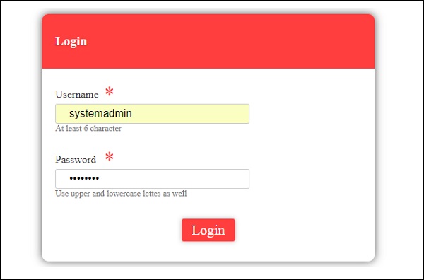
Upon clicking submit, a dialog box appears which shows Login Successful.
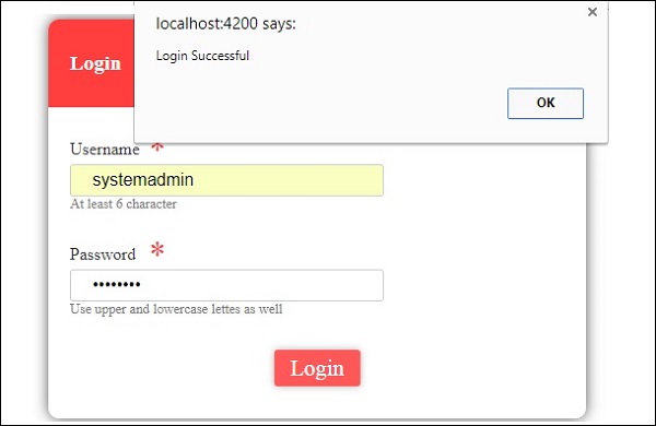
If the details are invalid, a dialog box appears which shows Invalid Login as shown below −
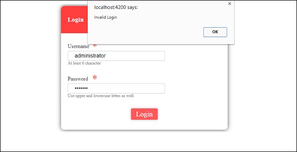
If the login is successful, it will proceed to the next form of Customer Details as shown below −
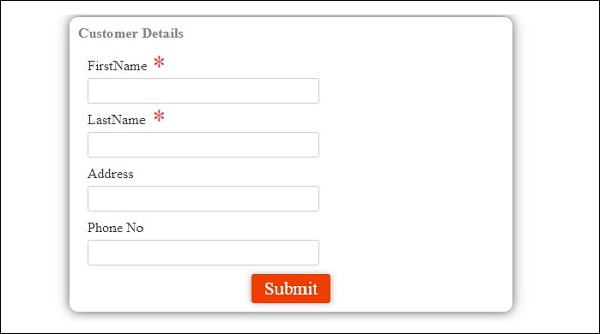
Once the details are entered and submitted, a dialog box appears which shows the Customer Details are added as shown in the screenshot below −
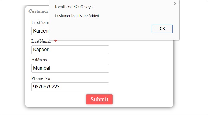
When we click OK in the above screenshot, the details will appear as shown in the screenshot below −
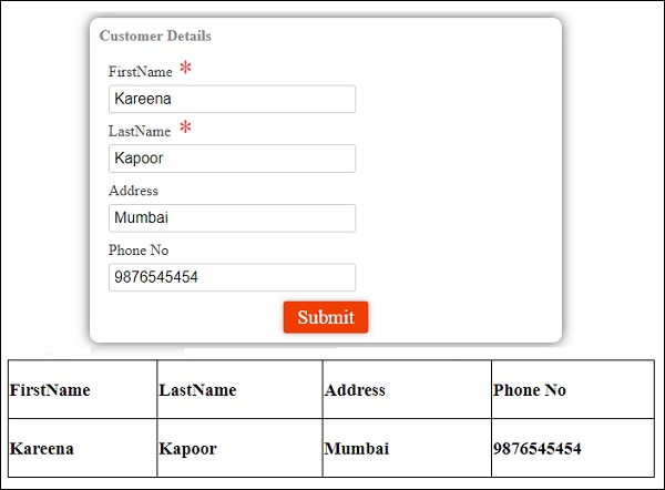


