
Big Data Analytics - Statistical Methods
When analyzing data, it is possible to have a statistical approach. The basic tools that are needed to perform basic analysis are −
- Correlation analysis
- Analysis of Variance
- Hypothesis Testing
When working with large datasets, it doesn’t involve a problem as these methods aren’t computationally intensive with the exception of Correlation Analysis. In this case, it is always possible to take a sample and the results should be robust.
Correlation Analysis
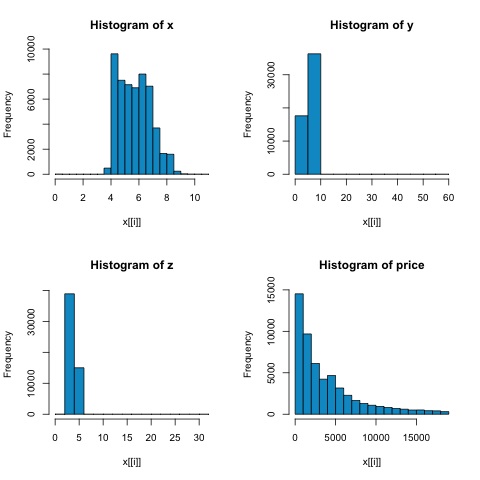
Correlation Analysis seeks to find linear relationships between numeric variables. This can be of use in different circumstances. One common use is exploratory data analysis, in section 16.0.2 of the book there is a basic example of this approach. First of all, the correlation metric used in the mentioned example is based on the Pearson coefficient. There is however, another interesting metric of correlation that is not affected by outliers. This metric is called the spearman correlation.
The spearman correlation metric is more robust to the presence of outliers than the Pearson method and gives better estimates of linear relations between numeric variable when the data is not normally distributed.
library(ggplot2)

# Select variables that are interesting to compare pearson and spearman
correlation methods.
x = diamonds[, c('x', 'y', 'z', 'price')]

# From the histograms we can expect differences in the correlations of both
metrics.
# In this case as the variables are clearly not normally distributed, the
spearman correlation

# is a better estimate of the linear relation among numeric variables.
par(mfrow = c(2,2))
colnm = names(x)
for(i in 1:4) {
   hist(x[[i]], col = 'deepskyblue3', main = sprintf('Histogram of %s', colnm[i]))
}
par(mfrow = c(1,1))
From the histograms in the following figure, we can expect differences in the correlations of both metrics. In this case, as the variables are clearly not normally distributed, the spearman correlation is a better estimate of the linear relation among numeric variables.
In order to compute the correlation in R, open the file bda/part2/statistical_methods/correlation/correlation.R that has this code section.
## Correlation Matrix - Pearson and spearman
cor_pearson <- cor(x, method = 'pearson')
cor_spearman <- cor(x, method = 'spearman')

### Pearson Correlation
print(cor_pearson)
#            x          y          z        price
# x      1.0000000  0.9747015  0.9707718  0.8844352
# y      0.9747015  1.0000000  0.9520057  0.8654209
# z      0.9707718  0.9520057  1.0000000  0.8612494
# price  0.8844352  0.8654209  0.8612494  1.0000000

### Spearman Correlation
print(cor_spearman)
#              x          y          z      price
# x      1.0000000  0.9978949  0.9873553  0.9631961
# y      0.9978949  1.0000000  0.9870675  0.9627188
# z      0.9873553  0.9870675  1.0000000  0.9572323
# price  0.9631961  0.9627188  0.9572323  1.0000000
Chi-squared Test
The chi-squared test allows us to test if two random variables are independent. This means that the probability distribution of each variable doesn’t influence the other. In order to evaluate the test in R we need first to create a contingency table, and then pass the table to the chisq.test R function.
For example, let’s check if there is an association between the variables: cut and color from the diamonds dataset. The test is formally defined as −
- H0: The variable cut and diamond are independent
- H1: The variable cut and diamond are not independent
We would assume there is a relationship between these two variables by their name, but the test can give an objective "rule" saying how significant this result is or not.
In the following code snippet, we found that the p-value of the test is 2.2e-16, this is almost zero in practical terms. Then after running the test doing a Monte Carlo simulation, we found that the p-value is 0.0004998 which is still quite lower than the threshold 0.05. This result means that we reject the null hypothesis (H0), so we believe the variables cut and color are not independent.
library(ggplot2)

# Use the table function to compute the contingency table
tbl = table(diamonds$cut, diamonds$color)
tbl

#              D    E    F    G    H    I    J
# Fair       163  224  312  314  303  175  119
# Good       662  933  909  871  702  522  307
# Very Good 1513 2400 2164 2299 1824 1204  678
# Premium   1603 2337 2331 2924 2360 1428  808
# Ideal     2834 3903 3826 4884 3115 2093  896

# In order to run the test we just use the chisq.test function.
chisq.test(tbl)

# Pearson’s Chi-squared test
# data:  tbl
# X-squared = 310.32, df = 24, p-value < 2.2e-16
# It is also possible to compute the p-values using a monte-carlo simulation
# It's needed to add the simulate.p.value = TRUE flag and the amount of
simulations
chisq.test(tbl, simulate.p.value = TRUE, B = 2000)

# Pearson’s Chi-squared test with simulated p-value (based on 2000 replicates)
# data:  tbl
# X-squared = 310.32, df = NA, p-value = 0.0004998
T-test
The idea of t-test is to evaluate if there are differences in a numeric variable # distribution between different groups of a nominal variable. In order to demonstrate this, I will select the levels of the Fair and Ideal levels of the factor variable cut, then we will compare the values a numeric variable among those two groups.
data = diamonds[diamonds$cut %in% c('Fair', 'Ideal'), ]

data$cut = droplevels.factor(data$cut) # Drop levels that aren’t used from the
cut variable
df1 = data[, c('cut', 'price')]

# We can see the price means are different for each group
tapply(df1$price, df1$cut, mean)
# Fair    Ideal
# 4358.758 3457.542
The t-tests are implemented in R with the t.test function. The formula interface to t.test is the simplest way to use it, the idea is that a numeric variable is explained by a group variable.
For example: t.test(numeric_variable ~ group_variable, data = data). In the previous example, the numeric_variable is price and the group_variable is cut.
From a statistical perspective, we are testing if there are differences in the distributions of the numeric variable among two groups. Formally the hypothesis test is described with a null (H0) hypothesis and an alternative hypothesis (H1).
H0: There are no differences in the distributions of the price variable among the Fair and Ideal groups
H1 There are differences in the distributions of the price variable among the Fair and Ideal groups
The following can be implemented in R with the following code −
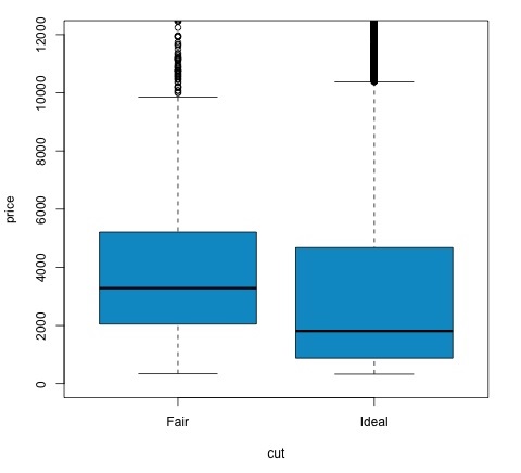
t.test(price ~ cut, data = data)

# Welch Two Sample t-test
#
# data:  price by cut
# t = 9.7484, df = 1894.8, p-value < 2.2e-16
# alternative hypothesis: true difference in means is not equal to 0
# 95 percent confidence interval:
#   719.9065 1082.5251
# sample estimates:
#   mean in group Fair mean in group Ideal
#   4358.758            3457.542

# Another way to validate the previous results is to just plot the
distributions using a box-plot
plot(price ~ cut, data = data, ylim = c(0,12000),
   col = 'deepskyblue3')
We can analyze the test result by checking if the p-value is lower than 0.05. If this is the case, we keep the alternative hypothesis. This means we have found differences of price among the two levels of the cut factor. By the names of the levels we would have expected this result, but we wouldn’t have expected that the mean price in the Fail group would be higher than in the Ideal group. We can see this by comparing the means of each factor.
The plot command produces a graph that shows the relationship between the price and cut variable. It is a box-plot; we have covered this plot in section 16.0.1 but it basically shows the distribution of the price variable for the two levels of cut we are analyzing.
Analysis of Variance
Analysis of Variance (ANOVA) is a statistical model used to analyze the differences among group distribution by comparing the mean and variance of each group, the model was developed by Ronald Fisher. ANOVA provides a statistical test of whether or not the means of several groups are equal, and therefore generalizes the t-test to more than two groups.
ANOVAs are useful for comparing three or more groups for statistical significance because doing multiple two-sample t-tests would result in an increased chance of committing a statistical type I error.
In terms of providing a mathematical explanation, the following is needed to understand the test.
xij = x + (xi − x) + (xij − x)
This leads to the following model −
xij = μ + αi + ∈ij
where μ is the grand mean and αi is the ith group mean. The error term ∈ij is assumed to be iid from a normal distribution. The null hypothesis of the test is that −
α1 = α2 = … = αk
In terms of computing the test statistic, we need to compute two values −
- Sum of squares for between group difference −
$$SSD_B = \sum_{i}^{k} \sum_{j}^{n}(\bar{x_{\bar{i}}} - \bar{x})^2$$
- Sums of squares within groups
$$SSD_W = \sum_{i}^{k} \sum_{j}^{n}(\bar{x_{\bar{ij}}} - \bar{x_{\bar{i}}})^2$$
where SSDB has a degree of freedom of k−1 and SSDW has a degree of freedom of N−k. Then we can define the mean squared differences for each metric.
MSB = SSDB / (k - 1)
MSw = SSDw / (N - k)
Finally, the test statistic in ANOVA is defined as the ratio of the above two quantities
F = MSB / MSw
which follows a F-distribution with k−1 and N−k degrees of freedom. If null hypothesis is true, F would likely be close to 1. Otherwise, the between group mean square MSB is likely to be large, which results in a large F value.
Basically, ANOVA examines the two sources of the total variance and sees which part contributes more. This is why it is called analysis of variance although the intention is to compare group means.
In terms of computing the statistic, it is actually rather simple to do in R. The following example will demonstrate how it is done and plot the results.
library(ggplot2)
# We will be using the mtcars dataset

head(mtcars)
#                    mpg  cyl disp  hp drat  wt  qsec   vs am  gear carb
# Mazda RX4         21.0   6  160 110 3.90 2.620 16.46  0  1    4    4
# Mazda RX4 Wag     21.0   6  160 110 3.90 2.875 17.02  0  1    4    4
# Datsun 710        22.8   4  108  93 3.85 2.320 18.61  1  1    4    1
# Hornet 4 Drive    21.4   6  258 110 3.08 3.215 19.44  1  0    3    1
# Hornet Sportabout 18.7   8  360 175 3.15 3.440 17.02  0  0    3    2
# Valiant           18.1   6  225 105 2.76 3.460 20.22  1  0    3    1

# Let's see if there are differences between the groups of cyl in the mpg variable.
data = mtcars[, c('mpg', 'cyl')]
fit = lm(mpg ~ cyl, data = mtcars)
anova(fit)

# Analysis of Variance Table
# Response: mpg
#           Df Sum Sq Mean Sq F value    Pr(>F)
# cyl        1 817.71  817.71  79.561 6.113e-10 ***
# Residuals 30 308.33   10.28
# Signif. codes:  0 *** 0.001 ** 0.01 * 0.05 .
# Plot the distribution
plot(mpg ~ as.factor(cyl), data = mtcars, col = 'deepskyblue3')
The code will produce the following output −
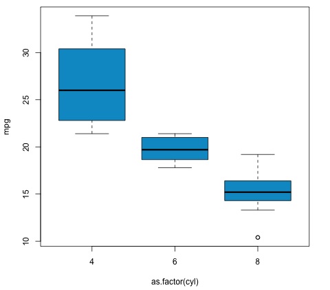
The p-value we get in the example is significantly smaller than 0.05, so R returns the symbol '***' to denote this. It means we reject the null hypothesis and that we find differences between the mpg means among the different groups of the cyl variable.


