Power BI - Data Modeling
In this chapter, you will learn about data modeling in Power BI.
Using Data Modeling and Navigation
Data Modeling is one of the features used to connect multiple data sources in BI tool using a relationship. A relationship defines how data sources are connected with each other and you can create interesting data visualizations on multiple data sources.
With the modeling feature, you can build custom calculations on the existing tables and these columns can be directly presented into Power BI visualizations. This allows businesses to define new metrics and to perform custom calculations for those metrics.
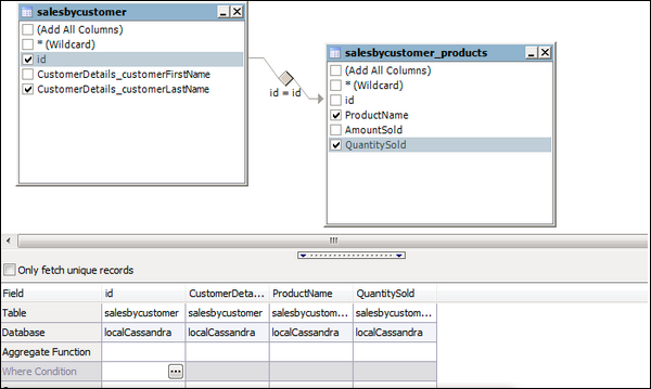
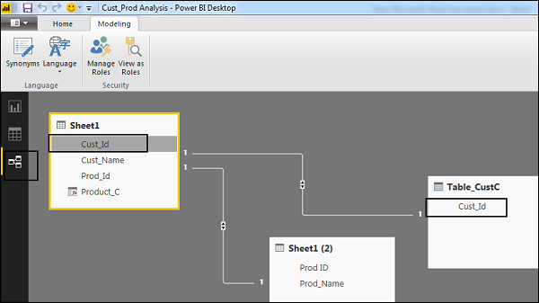
In the above image, you can see a common data model, which shows a relationship between two tables. Both tables are joined using a column name “Id”.
Similarly, in Power BI, you set the relationship between two objects. To set the relationship, you have to drag a line between the common columns. You can also view the “Relationship” in a data model in Power BI.
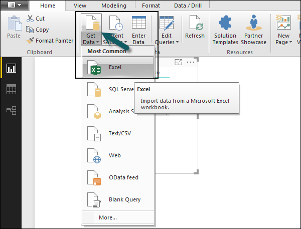
To create data model in Power BI, you need to add all data sources in Power BI new report option. To add a data source, go to the Get data option. Then, select the data source you want to connect and click the Connect button.
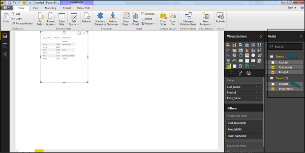
Once you add a data source, it is presented on the right side bar. In the following image, we have used 2 xls file to import data - Customer and Product.
In Power BI on the left side of the screen, you have the following three tabs −
- Report
- Data
- Relationships
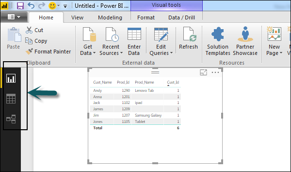
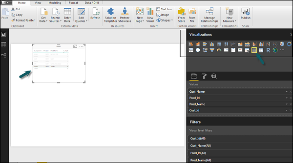
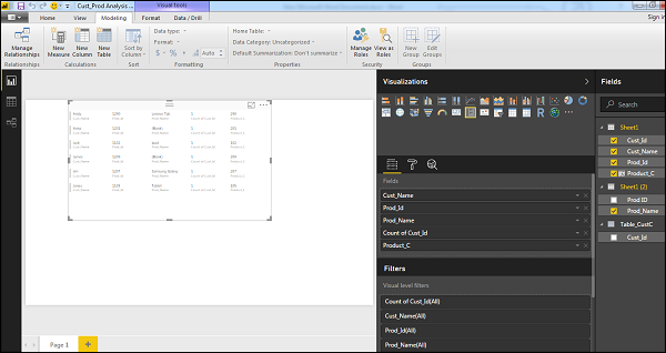
When you navigate to the Report tab, you can see a dashboard and a chart selected for data visualization. You can select different chart types as per your need. In our example, we have selected a Table type from available Visualizations.
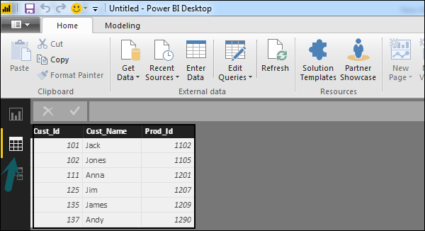
When you go to the Data tab, you can see all the data as per the defined Relationship from the data sources.
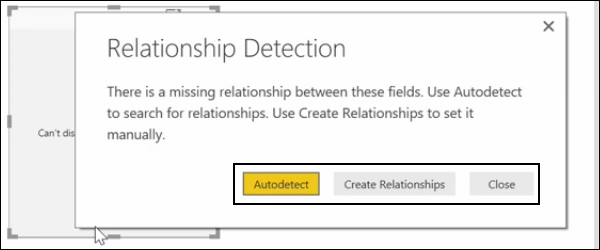
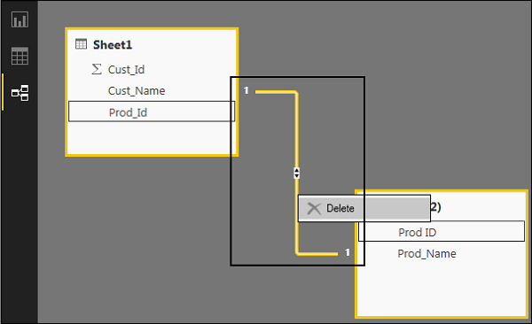
In the Relationship tab, you can see the relationship between data sources. When you add multiple data sources to Power BI visualization, the tool automatically tries to detect the relationship between the columns. When you navigate to the Relationship tab, you can view the relationship. You can also create a Relationship between the columns using Create Relationships option.
You can also add and remove relationships in data visualization. To remove a relationship, you have to right-click and select the “Delete” option. To create a new “Relationship”, you just need to drag and drop the fields that you want to link between the data sources.
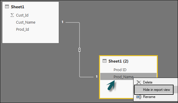
You can also use the Relationship view to hide a particular column in the report. To hide a column, right-click on the column name and select the “Hide in report view” option.
Creating Calculated Columns
You can create calculated columns in Power BI by combining two or more elements of the existing data. You can also apply calculation on an existing column to define a new metric or combine two columns to create one new column.
You can even create a calculated column to establish a relationship between the tables and it can also be used to setup a relationship between two tables.
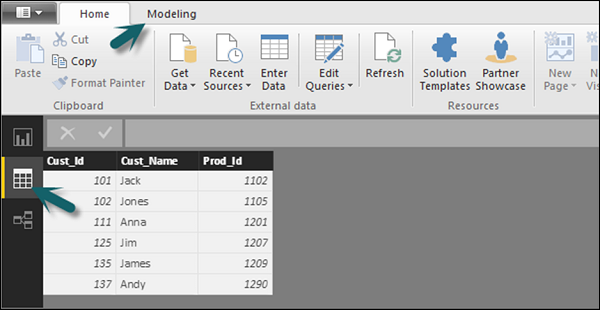
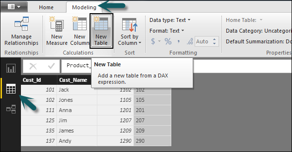
To create a new calculated column, navigate to Data View tab on the left side of the screen and then click Modeling.
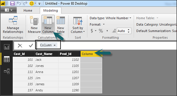
When you navigate to the Modeling tab, you can see a New Column option at the top of the screen. This also opens the formula bar, where you can enter DAX formula to perform calculation. DAX- Data Analysis Expression is a powerful language also used in Excel to perform calculations. You can also rename the column by changing the Column text in the formula bar.
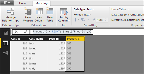
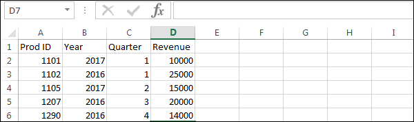
In the following example, let us create a new column: Product Code (Product_C), which is derived from the last three characters of Prod_Id column. Then, write the following formula −
Product_C = RIGHT( Sheet1[Prod_Id],3)
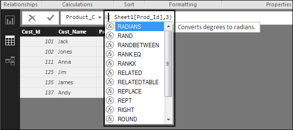
A long list of formulas is also provided that you can use for creating calculated columns. You have to enter the first character of formula to be used in calculations as shown in the following screenshot.
Creating Calculated Tables
You can also create a new calculated table in data modeling in Power BI. To create a new table, navigate to the Data View tab on the left side of the screen, and then go to the Modeling option at the top of the screen.
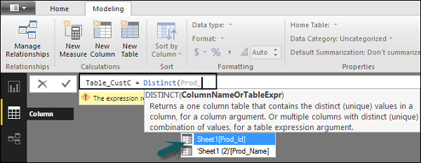
DAX expression is used to create the new table. You have to enter the name of a new table on the left side of the equal sign and DAX formula to perform the calculation to form that table on the right. When the calculation is complete, the new table appears in the Fields pane in your model.
In the following example, let us define a new table - Table_CustC that returns a one column table containing unique values in a column in another table.
A new table is added under the “Fields” section in Power BI screen as shown in the following screenshot. Once the calculated column and calculated tables are created as per your requirement, you can use the fields in the Report tab in Power BI.
To add these objects, you have to select a checkbox and a relationship is automatically detected if possible. If not, then you can drag the columns that you want to connect.
To view the report, you navigate to the Report tab and you can see both “Calculated columns” and fields from the new “Calculated table” in the report view.
Managing Time-Based Data
Power BI allows to drill through time-based data by default. When you add a date field in your analysis and enable drill on your data visualization, it takes you to the next level of time-based data.
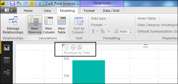
Let us consider we have added Time-based table in Power BI visualization. We have added Revenue and Year column in our report.
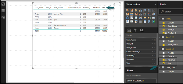
We can enable the drill feature in visualizations using the option at the top. Once we enable the drill feature and click the bars or lines in the chart, it drills down to the next level of time hierarchy. Example: Years → Quarters → Months.
We can also use Go to the next level in the hierarchy option to perform a Drill.