
Power BI - Visualization Options
In this chapter, you will learn about the various visualization options in Power BI.
Creating Simple Visualizations
Visualizations are used to effectively present your data and are the basic building blocks of any Business Intelligence tool. Power BI contains various default data visualization components that include simple bar charts to pie charts to maps, and also complex models such as waterfalls, funnels, gauges, and many other components.
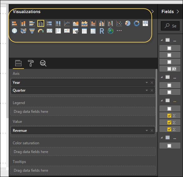
In Power BI, you can create visualization in two ways. First is by adding from the right side pane to Report Canvas. By default, it is the table type visualization, which is selected in Power BI. Another way is to drag the fields from right side bar to the axis and value axis under Visualization. You can add multiple fields to each axis as per the requirement.
In Power BI, it is also possible to move your visualization on the reporting canvas by clicking and then dragging it. You can also switch between different type of charts and visualizations from the Visualization pane. Power BI attempts to convert your selected fields to the new visual type as closely as possible.
Creating Map Visualizations
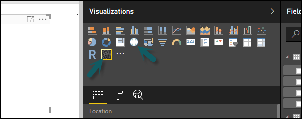
In Power BI, we have two types of map visualization - bubble maps and shape maps. If you want to create a bubble map, select the map option from the visualization pane.
To use a bubble map, drag the map from Visualizations to the Report Canvas. To display values, you have to add any location object to the axis.
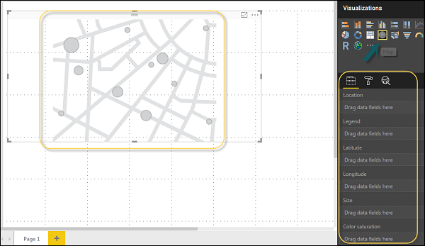
In the value fields, you can see that it accepts values axis such as City and State and or you can also add longitude and latitude values. To change the bubble size, you need to add a field to the value axis.
You can also use a filled map in data visualization, just by dragging the filled map to the Report Canvas.
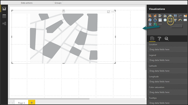
Note − If you see a warning symbol on top of your map visualization, it means that you need to add more locations to your map chart.
Using Combination Charts
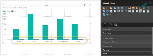
In data visualization, it is also required to plot multiple measures in a single chart. Power BI supports various combination chart types to plot measure values. Let us say you want to plot revenue and unit_solds in one chart. Combination charts are the most suitable option for these kind of requirement.
One of the most common Combination chart in Power BI is Line and Stacked column charts. Let us say we have a revenue field and we have added a new data source that contains customer-wise unit quantity and we want to plot this in our visualization.
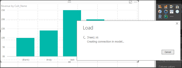
Once you add a data source, it will be added to the list of fields on the right side. You can add units to the column axis as shown in the following screenshot.
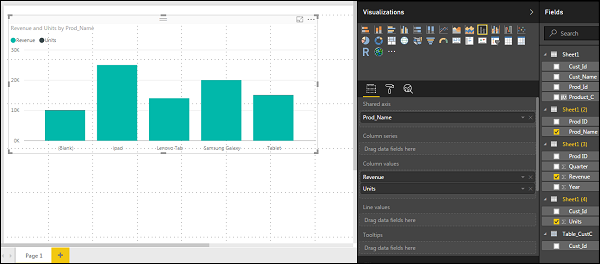
You have other type of combine chart that you can use in Power BI - Line and Clustered Column.
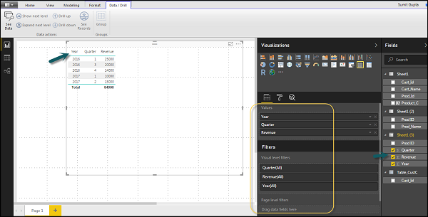
Using Tables
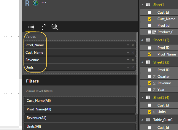
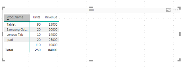
In Power BI, when you add a dataset to your visualization, it adds a table chart to the Report canvas. You can drag the fields that you want to add to the report. You can also select the checkbox in front of each field to add those to the Report area.
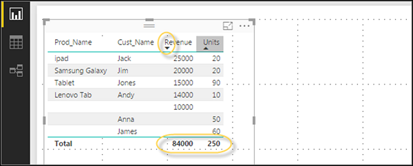
With the numerical values in a table, you can see a sum of values at the bottom.
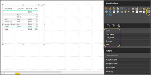
You can also perform a sort in the table using an arrow key at the top of the column. To perform ascending/descending sort, just click the arrow mark, and the values in the column will be sorted.
The order of the columns in a table is determined by the order in the value bucket on the right side. If you want to change the order, you can delete any column and add the other one.
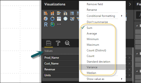
You can also undo summarize or apply different aggregate function on numerical values in the table. To change the aggregation type, click the arrow in the value bucket in front of the measure and you will see a list of formulas that can be used.
Another table type in Power BI is the matrix table that provides a lot of features such as auto sizing, column tables, and setting colors, etc.
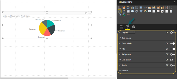
Modify Colors in Charts
In Power BI, you can also modify the colors in the chart. When you select any visualization, it has an option to change the color. Following options are available under the Format tab −
- Legend
- Data Colors
- Detail Label
- Title
- Background
- Lock Aspect
- Border
- General
To open these options, go to the Format tab as shown in the following screenshot. Once you click, you can see all the options available.
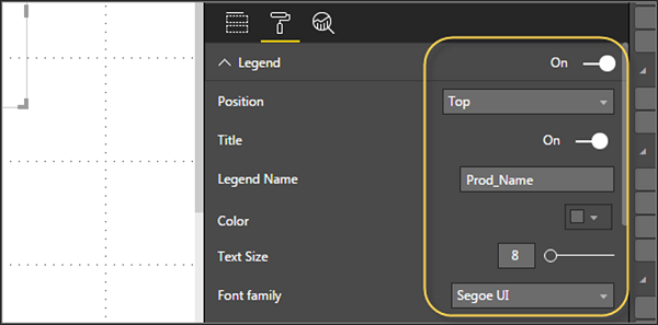
When you expand the Legend field, you have an option where you want to display the legend. You can select −
- Position
- Title
- Legend Name
- Color
- Text Size
- Font Family
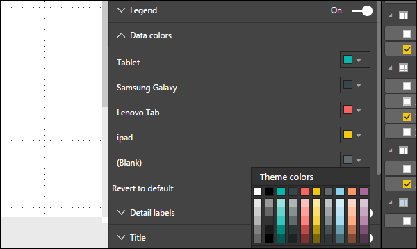
Similarly, you have data colors. In case, you want to change the color of any data field, you can use this option. It shows all objects and their corresponding colors in the chart.
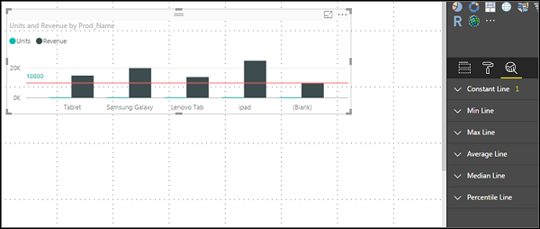
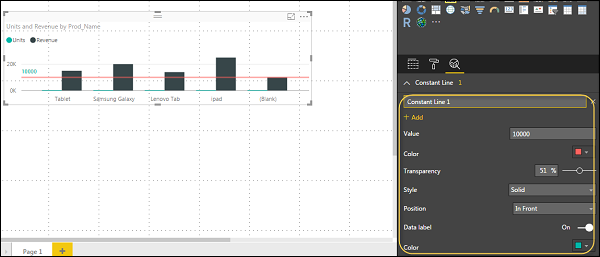
You also have Analytics feature in the tool, where you can draw lines as per requirement in data visualization. You have the following line types in data visualization −
- Constant Line
- Min Line
- Max Line
- Average Line
- Median Line
- Percentile Line
You can opt for a dashed, dotted, or a solid line. You can select Transparency level, color, and position of the line. You can also switch on/off data label for this line.
Adding Shapes, Images and Text box
Sometimes it is required that you need to add static text, images, or shapes to your visualization. In case you want to add header/footer or any static signatures, messages to data visualization this option can be used.
You can also add URLs in the text box and Power BI uses those link to make it live.
To add shapes, images and text box, navigate to the Home tab and at the top you will find an option to add images.
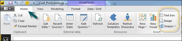
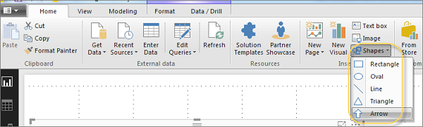
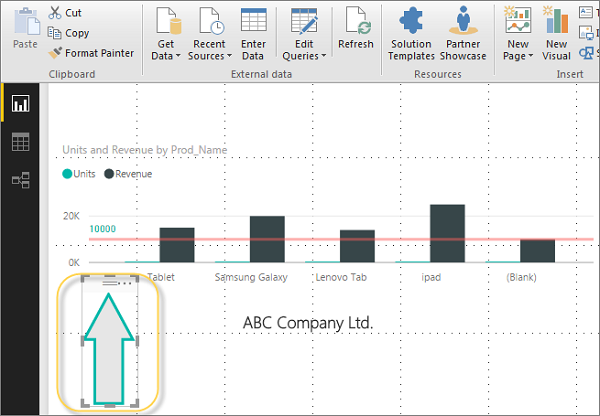
You can insert different shapes in data visualization. To see the available shapes, click the arrow next to the Shapes button.
When you click on the text box, it adds a text box in your Report canvas. You can enter any text in the text box and use the rich text editor to make formatting changes.
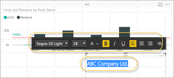
Similarly, images can be added to data visualization to add logos or other images to data visualization. When you click the Image option, it asks for a path to pass the image file.
You can add shapes by selecting any shape from the dropdown list. You can also resize it using different options.
Styling Reports
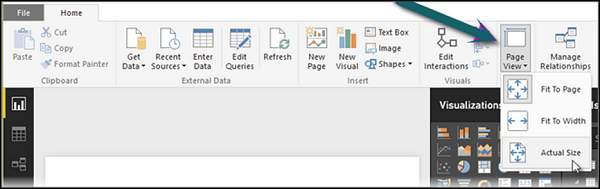
In Power BI, you have flexible options to adjust the page layout and formatting such as orientation and page size of your report. Navigate to Page View menu from the Home tab and the following options are provided.
- Fit to Page
- Fit to Width
- Actual Size
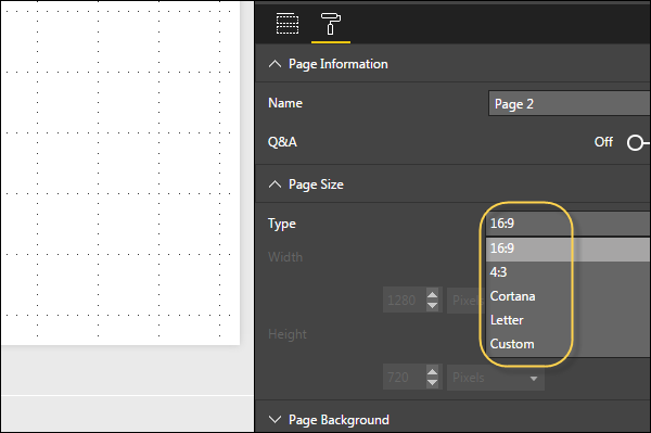
By default, the page size in a report is 16:9; however, it is also possible to change the page size of the report. To change the page size, navigate to the Visualization pane and select Paint brush.
Note − To change page size, no visualization should be added to the Report canvas. You have the following options available under Page layout −
- Page Information
- Page Size
- Page Background
Under Page Information, you have Name and Q&A.
Under Page Size, you can select from the following options −
- Type
- Width
- Height
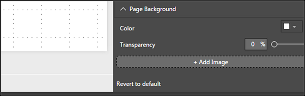
Under Page Background, you can select from the following options:
- Color
- Transparency
- Add Image
Duplicating Reports
In some scenarios, you may want to use the same layout and visuals for different pages. Power BI provides an option to create a copy of the page. When you use Duplicate Page option, a new page is added with similar layout and visuals.
To duplicate a page, right-click the Page and select Duplicate Page option. This will create a copy of the same page with the name - Duplicate of Page1.
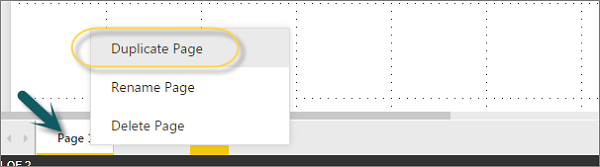
Now, if you want to rename an existing page or delete a page, you can use other options as shown in the above screenshot.


