SAS - Pie Charts
A pie-chart is a representation of values as slices of a circle with different colors. The slices are labeled and the numbers corresponding to each slice is also represented in the chart.
In SAS the pie chart is created using PROC TEMPLATE which takes parameters to control percentage, labels, color, title etc.
Syntax
The basic syntax to create a pie-chart in SAS is −
PROC TEMPLATE;
   DEFINE STATGRAPH pie;
      BEGINGRAPH;
         LAYOUT REGION;
            PIECHART CATEGORY = variable /
            DATALABELLOCATION = OUTSIDE
            CATEGORYDIRECTION = CLOCKWISE
            START = 180 NAME = 'pie';
            DISCRETELEGEND 'pie' /
            TITLE = ' ';
         ENDLAYOUT;
      ENDGRAPH;
   END;
RUN;
Following is the description of parameters used −
variable is the value for which we create the pie chart.
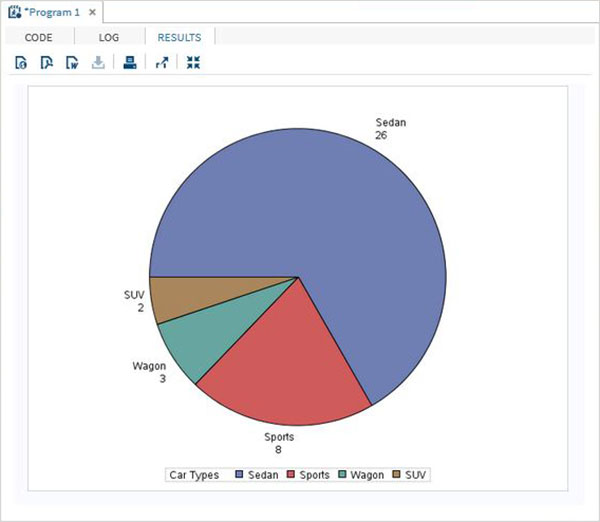
Simple Pie Chart
In this pie chart we take a single variable form the dataset. The pie chart is created with value of the slices representing the fraction of the count of the variable with respect to the total value of the variable.
Example
In the below example each slice represents the fraction of the type of car from the total number of cars.
PROC SQL;
create table CARS1 as
SELECT make, model, type, invoice, horsepower, length, weight
 FROM
SASHELP.CARS
WHERE make in ('Audi','BMW')
;
RUN;

PROC TEMPLATE;
   DEFINE STATGRAPH pie;
      BEGINGRAPH;
         LAYOUT REGION;
            PIECHART CATEGORY = type /
            DATALABELLOCATION = OUTSIDE
            CATEGORYDIRECTION = CLOCKWISE
            START = 180 NAME = 'pie';
            DISCRETELEGEND 'pie' /
            TITLE = 'Car Types';
         ENDLAYOUT;
      ENDGRAPH;
   END;
RUN;
PROC SGRENDER DATA = cars1
            TEMPLATE = pie;
RUN;
When we execute the above code, we get the following output −
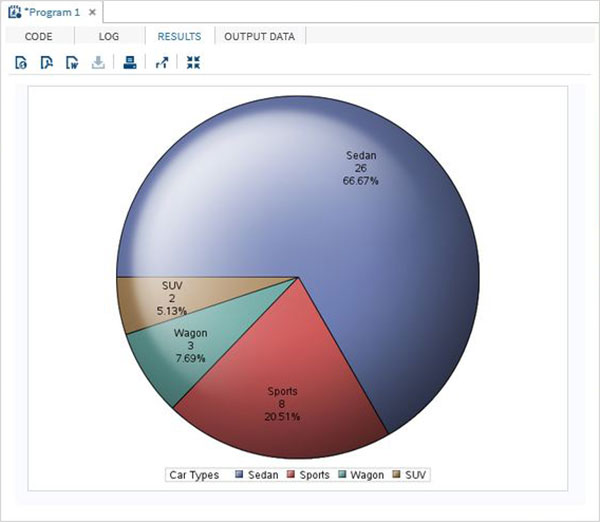
Pie Chart with Data Labels
In this pie chart we represent both the fractional value as well as the percentage value for each slice. We also change the location of the label to be inside the chart. The style of appearance of the chart is modified by using the DATASKIN option. It uses one of the inbuilt styles, available in the SAS environment.
Example
PROC TEMPLATE;
   DEFINE STATGRAPH pie;
      BEGINGRAPH;
         LAYOUT REGION;
            PIECHART CATEGORY = type /
            DATALABELLOCATION = INSIDE
            DATALABELCONTENT = ALL
            CATEGORYDIRECTION = CLOCKWISE
            DATASKIN = SHEEN
            START = 180 NAME = 'pie';
            DISCRETELEGEND 'pie' /
            TITLE = 'Car Types';
         ENDLAYOUT;
      ENDGRAPH;
   END;
RUN;
PROC SGRENDER DATA = cars1
            TEMPLATE = pie;
RUN;
When we execute the above code, we get the following output −
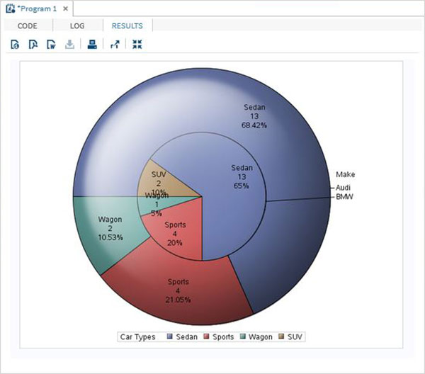
Grouped Pie Chart
In this pie chart the value of the variable presented in the graph is grouped with respect to another variable of the same data set. Each group becomes one circle and the chart has as many concentric circles as the number of groups available.
Example
In the below example we group the chart with respect to the variable named "Make". As there are two values available ("Audi" and "BMW") so we get two concentric circles each representing slices of car types in its own make.
PROC TEMPLATE;
   DEFINE STATGRAPH pie;
      BEGINGRAPH;
         LAYOUT REGION;
            PIECHART CATEGORY = type / Group = make
            DATALABELLOCATION = INSIDE
            DATALABELCONTENT = ALL
            CATEGORYDIRECTION = CLOCKWISE
            DATASKIN = SHEEN
            START = 180 NAME = 'pie';
            DISCRETELEGEND 'pie' /
            TITLE = 'Car Types';
         ENDLAYOUT;
      ENDGRAPH;
   END;
RUN;
PROC SGRENDER DATA = cars1
            TEMPLATE = pie;
RUN;
When we execute the above code, we get the following output −