SAS - Scatter Plots
A scatterplot is a type of graph which uses values from two variables plotted in a Cartesian plane. It is usually used to find out the relationship between two variables. In SAS we use PROC SGSCATTER to create scatterplots.
Please note that we create the data set named CARS1 in the first example and use the same data set for all the subsequent data sets. This data set remains in the work library till the end of the SAS session.
Syntax
The basic syntax to create a scatter-plot in SAS is −
PROC sgscatter  DATA = DATASET;
   PLOT VARIABLE_1 * VARIABLE_2
   / datalabel = VARIABLE group = VARIABLE;
RUN;
Following is the description of parameters used −
DATASET is the name of data set.
VARIABLE is the variable used from the dataset.
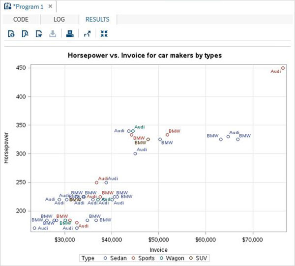
Simple Scatterplot
In a simple scatterplot we choose two variables form the dataset and group them with respect a third variable. We can also label the data. The result shows how the two variables are scattered in the Cartesian plane.
Example
PROC SQL;
create table CARS1 as
SELECT make, model, type, invoice, horsepower, length, weight
FROM
SASHELP.CARS
WHERE make in ('Audi','BMW')
;
RUN;

TITLE 'Scatterplot - Two Variables';
PROC sgscatter  DATA = CARS1;
   PLOT horsepower*Invoice
   / datalabel = make group = type grid;
   title 'Horsepower vs. Invoice for car makers by types';
RUN;
When we execute the above code, we get the following output −
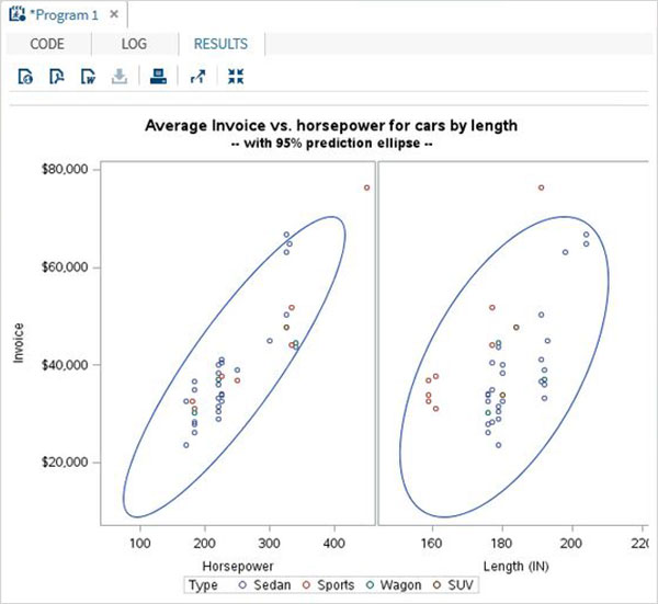
Scatterplot with Prediction
we can use an estimation parameter to predict the strength of correlation between by drawing an ellipse around the values. We use the additional options in the procedure to draw the ellipse as shown below.
Example
proc sgscatter data = cars1;
compare y = Invoice  x = (horsepower length)
         / group = type  ellipse =(alpha = 0.05 type = predicted);
title
'Average Invoice vs. horsepower for cars by length';
title2
'-- with 95% prediction ellipse --'
;
format
Invoice dollar6.0;
run;
When we execute the above code, we get the following output −
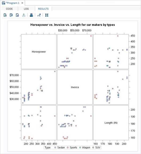
Scatter Matrix
We can also have a scatterplot involving more than two variables by grouping them into pairs. In the example below we consider three variables and draw a scatter plot matrix. We get 3 pairs of resulting matrix.
Example
PROC sgscatter  DATA = CARS1;
   matrix horsepower invoice length
   / group = type;

   title 'Horsepower vs. Invoice vs. Length for car makers by types';
RUN;
When we execute the above code, we get the following output −