
Tableau - Box Plot
The box plots are also known as a box-and-whisker plots. They show the distribution of values along an axis. Boxes indicate the middle 50 percent of the data which is, the middle two quartiles of the data's distribution. The remaining 50 percent of data on both sides is represented by lines also called whiskers, to display all points within 1.5 times the interquartile range, which is all points within 1.5 times the width of the adjoining box, or all points at the maximum extent of the data.
The Box Plots take one or more measures with zero or more dimensions.
Creating a Box Plot
Using the Sample-superstore, plan to find the size of profits for the respective category for each Ship mode values. To achieve this objective, following are the steps.
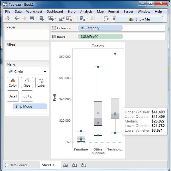
Step 1 − Drag and drop the dimension category to the Columns shelf and profit to the Rows shelf. Also drag the dimension Ship mode to the right of Category in Columns shelf.
Step 2 − Choose Box-and-Whisker plot from Show Me. The following chart appears which shows the box plots. Here, Tableau automatically reassigns the ship mode to the Marks card.
Box Plot with Two Dimensions
You can create box plots with two dimensions by adding another dimension to the Column shelf. In the above chart, add the region dimension to the Column shelf. This produces a chart which shows the box plots for each region.


