Tableau - Bubble Chart
Bubble charts display data as a cluster of circles. Each of the values in the dimension field represents a circle whereas the values of measure represent the size of those circles. As the values are not going to be presented in any row or column, you can drag the required fields to different shelves under the marks card.
Simple Bubble Chart
Using the Sample-superstore, let's plan to find the size of profits for different ship mode. To achieve this objective, following are the steps.
Step 1 − Drag and drop the measure profit into the Size shelf under Marks card.
Step 2 − Drag and drop the dimension ship mode into the Labels shelf under Marks card.
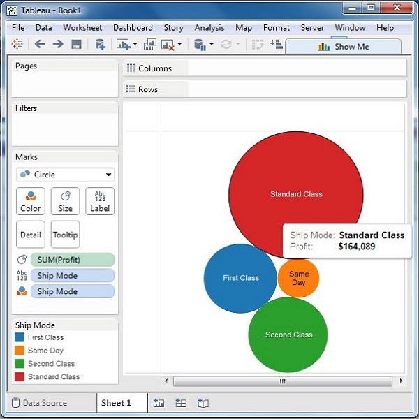
Step 3 − Pull the dimension ship mode to the Colors shelf under Marks card.
The following chart appears.
Bubble Chart with Measure Values
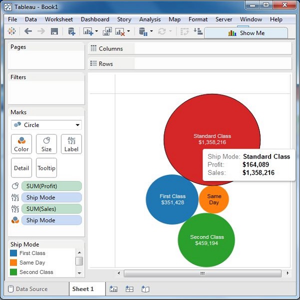
You can also show the values of the measure field which decides the size of the circles. To do this, drag the sales measure into the Labels shelf. The following chart appears.
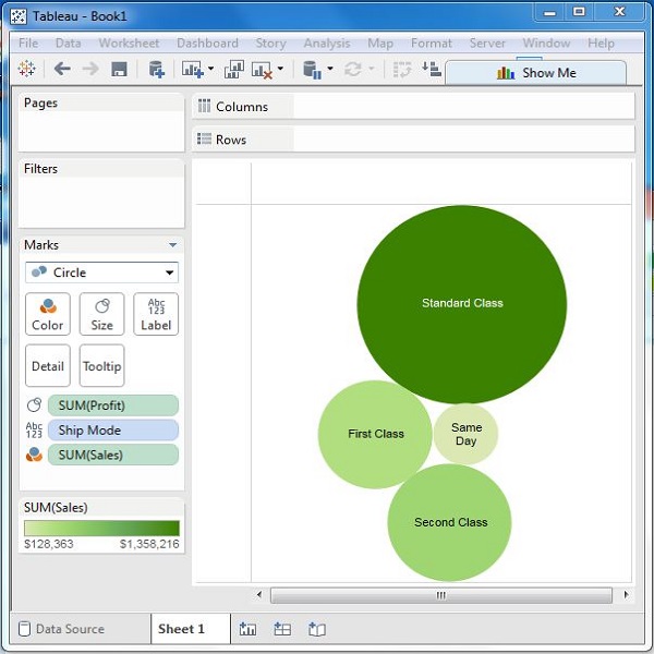
Bubble Chart with Measure Colors
Instead of coloring each circle with a different color, you can use a single color with different shades. For this, drag the measure sales into the color shelf. The higher values represent darker shades while the smaller values represent lighter shades.