Tableau - Bump Chart
A Bump Chart is used to compare two dimensions against each other using one of the Measure value. They are very useful for exploring the changes in Rank of a value over a time dimension or place dimension or some other dimension relevant to the analysis.
The Bump Chart takes two dimensions with zero or more measures.
Creating a Bump Chart
Using the Sample-superstore, plan to find the variation of ship mode of products with the variation of the Sub-Category. To achieve this objective, following are the steps.
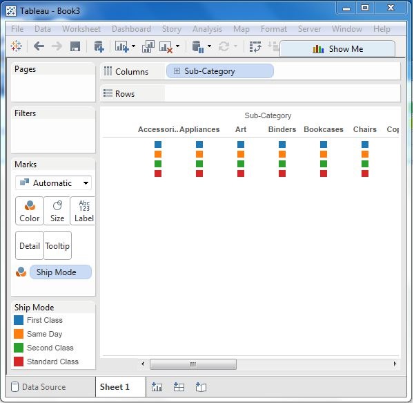
Step 1 − Drag and drop the dimension Sub-Category to the Columns shelf. Also drag the dimension Ship mode to the Color shelf under Marks card. Leave the chart type to Automatic. The following chart appears.
Step 2 − Next, create a calculated field called Rank. Go to Analysis → Create Calculated Field. Use Rank as the field name and write the expression index () in the calculation area. It is an inbuilt function that creates an index for the current row in the partition. Click OK and the new field will be visible in the measures section. Right-click on the field Rank and convert it to discrete.
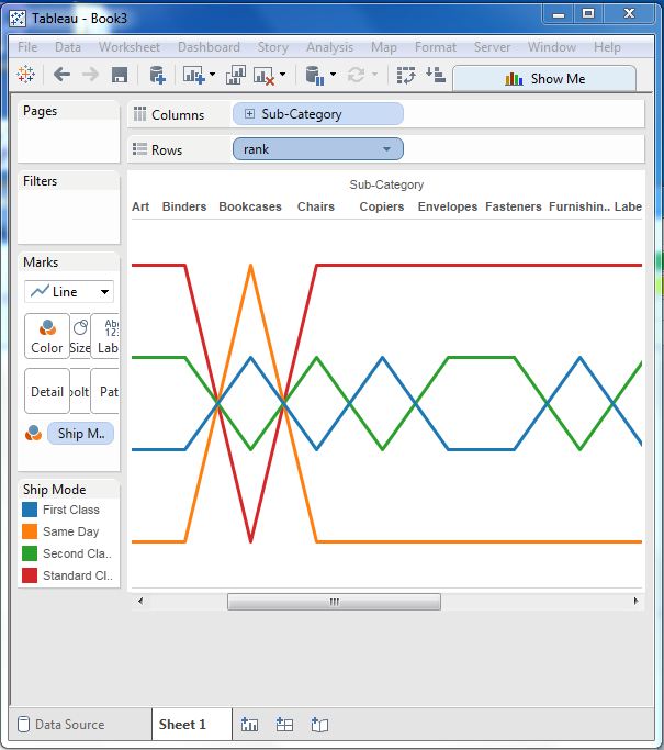
Step 3 − Drag Rank to the Rows shelf. The following chart appears which shows the dimension Sub-Category with each ship mode arranged in an increasing order of their Rank value.
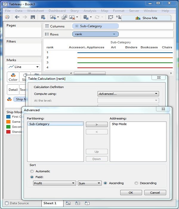
Step 4 − Apply some more calculation to the rank field using the measure Profit. Rightclick on Rank and choose Edit Table calculation. Choose the sorting by the field profit using partition by Sub-Category and addressed by ship mode. The following screenshot shows the calculations applied.
On completion of the above steps, you will get the bump chart as shown in the following screenshot. It shows the variation of profit for each ship mode across various subcategories.