Tableau - Get Started
In this chapter, you will learn some basic operations in Tableau to get acquainted with its interface. There are three basic steps involved in creating any Tableau data analysis report.
These three steps are −
Connect to a data source − It involves locating the data and using an appropriate type of connection to read the data.
Choose dimensions and measures − This involves selecting the required columns from the source data for analysis.
Apply visualization technique − This involves applying required visualization methods, such as a specific chart or graph type to the data being analyzed.
For convenience, let’s use the sample data set that comes with Tableau installation named sample – superstore.xls. Locate the installation folder of Tableau and go to My Tableau Repository. Under it, you will find the above file at Datasources\9.2\en_US-US.
Connect to a Data Source
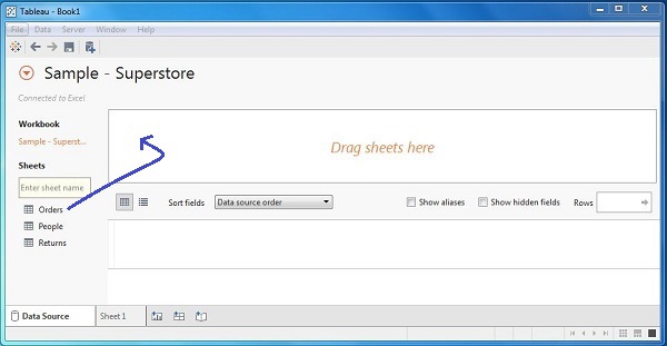
On opening Tableau, you will get the start page showing various data sources. Under the header “Connect”, you have options to choose a file or server or saved data source. Under Files, choose excel. Then navigate to the file “Sample – Superstore.xls” as mentioned above. The excel file has three sheets named Orders, People and Returns. Choose Orders.
Choose the Dimensions and Measures
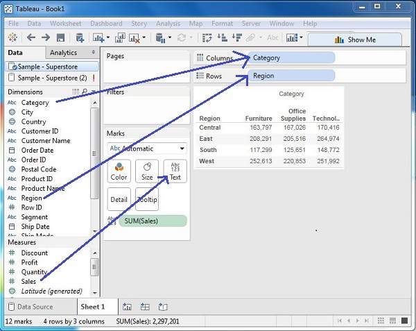
Next, choose the data to be analyzed by deciding on the dimensions and measures. Dimensions are the descriptive data while measures are numeric data. When put together, they help visualize the performance of the dimensional data with respect to the data which are measures. Choose Category and Region as the dimensions and Sales as the measure. Drag and drop them as shown in the following screenshot. The result shows the total sales in each category for each region.
Apply Visualization Technique
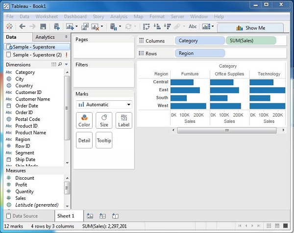
In the previous step, you can see that the data is available only as numbers. You have to read and calculate each of the values to judge the performance. However, you can see them as graphs or charts with different colors to make a quicker judgment.
We drag and drop the sum (sales) column from the Marks tab to the Columns shelf. The table showing the numeric values of sales now turns into a bar chart automatically.
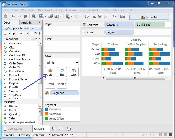
You can apply a technique of adding another dimension to the existing data. This will add more colors to the existing bar chart as shown in the following screenshot.