Tableau - Motion Charts
Motion charts show data using the X and Y-axes, displaying changes over time by showing the movement of data points within the defined space as well as changes in the color of the lines. The main advantage of motion chart is to view the entire trail of how the data has changed over time and not just a snapshot of the data.
Tableau needs one Time Dimension and one Measure to create a Motion chart.
Creating a Motion Chart
Using the Sample-superstore, plan to find the variation of Profits over the months. To achieve this objective, following are the steps.
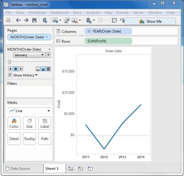
Step 1 − Drag the Dimension Order Date to the Columns Shelf. Drag it again to the Pages Shelf. In the Pages shelf, right-click on the Order Date and choose Month. Then drag the measure Profit to the Rows Shelf. The following chart appears.
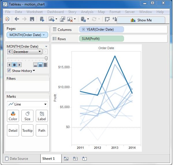
Step 2 − Put a check mark on the box next to Show History and then click on the dropdown arrow next to it. For “Marks to Show History For” select “All”. Then under “Show”, select “Both”. Selecting “Marks” shows only the points and selecting “Trails” shows only the line. Click the Play button. The following chart appears.
Step 3 − Allowing the chart to run from January to December will create the chart which shows how the profits have varied over each month for all the years. Note that as the data changes the recent months get a darker shade of color and the historical data gets a lighter shade of color.
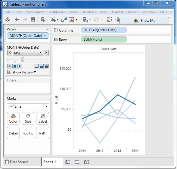
Finally, you will get the following chart.