
SAP Lumira - Chart Types
Advertisements
There are different types of charts available in Lumira.
Comparison − These chart types are used to compare the difference between values. Common comparison-type charts are −
- Bar Chart
- Column Chart
- Radar Chart
- Area Chart
- Heat map
Percentage − These are used to show percentage of parts in a chart. Common Percentage-type charts are −
- Pie Chart
- Donut Chart
- Tree
- Funnel Chart
Correlation − These are used to show the relationship between different values. Common chart types are −
- Scatter Plot
- Bubble Chart
- Network Chart
- Numeric Point
- Tree
Trend − These are used to show the data patterns or possible patterns. Common chart types are −
- Line Chart
- Waterfall Chart
- Box Plot
- Parallel Coordinates Chart
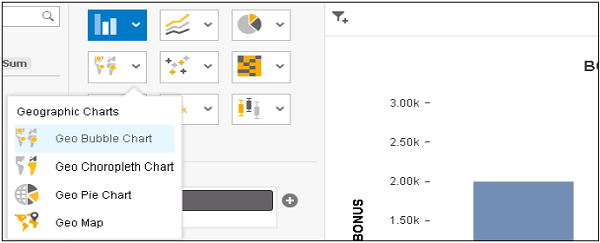
Geographic − These are used to present the map of a country or globe present in the analysis. Common chart types are −
- Geo Bubble Chart
- Geo Choropleth Chart
- Geo Pie Chart
- Geo Map
Advertisements


