
Ionic - Checkbox
Ionic checkbox is almost the same as toggle. These two are styled differently but are used for the same purposes.
Adding Checkbox
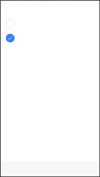
When creating a checkbox form, you need to add the checkbox class name to both label and the input elements. The following example shows two simple checkboxes, one is checked and the other is not.
<label class = "checkbox">
   <input type = "checkbox">
</label>

<label class = "checkbox">
   <input type = "checkbox">
</label>
The above code will produce the following screen −
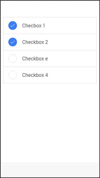
Multiple Checkboxes
As we already showed, the list will be used for multiple elements. Now we will use the item-checkbox class for each list item.
<ul class = "list">
   <li class = "item item-checkbox">
      Checkbox 1
      <label class = "checkbox">
         <input type = "checkbox" />
      </label>
   </li>

   <li class = "item item-checkbox">
      Checkbox 2
      <label class = "checkbox">
         <input type = "checkbox" />
      </label>
   </li>

   <li class = "item item-checkbox">
      Checkbox e
      <label class = "checkbox">
         <input type = "checkbox" />
      </label>
   </li>

   <li class = "item item-checkbox">
      Checkbox 4
      <label class = "checkbox">
         <input type = "checkbox" />
      </label>
   </li>
</ul>
The above code will produce the following screen −
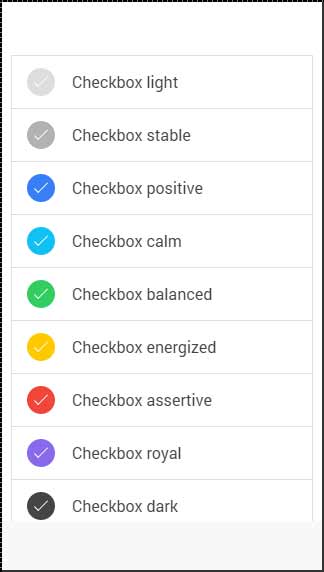
Styling Checkbox
When you want to style a checkbox, you need to apply any Ionic color class with the checkbox prefix. Check the following example to see how it looks like. We will use the list of checkboxes for this example.
<ul class = "list">
   <li class = "item item-checkbox checkbox-light">
      Checkbox 1
      <label class = "checkbox">
         <input type = "checkbox" />
      </label>
   </li>

   <li class = "item item-checkbox checkbox-stable">
      Checkbox 2
      <label class = "checkbox">
         <input type = "checkbox" />
      </label>
   </li>

   <li class = "item item-checkbox  checkbox-positive">
      Checkbox 3
      <label class = "checkbox">
         <input type = "checkbox" />
      </label>
   </li>

   <li class = "item item-checkbox  checkbox-calm">
      Checkbox 4
      <label class = "checkbox">
         <input type = "checkbox" />
      </label>
   </li>

   <li class = "item item-checkbox  checkbox-balanced">
      Checkbox 5
      <label class = "checkbox">
         <input type = "checkbox" />
      </label>
   </li>

   <li class = "item item-checkbox  checkbox-energized">
      Checkbox 6
      <label class = "checkbox">
         <input type = "checkbox" />
      </label>
   </li>

   <li class = "item item-checkbox  checkbox-assertive">
      Checkbox 7
      <label class = "checkbox">
         <input type = "checkbox" />
      </label>
   </li>

   <li class = "item item-checkbox  checkbox-royal">
      Checkbox 8
      <label class = "checkbox">
         <input type = "checkbox" />
      </label>
   </li>

   <li class = "item item-checkbox  checkbox-dark">
      Checkbox 9
      <label class = "checkbox">
         <input type = "checkbox" />
      </label>
   </li>
</ul>
The above code will produce the following screen −


