
Ionic - Radio Button
Radio buttons are another form of an element, which we will be covering in this chapter. The difference between radio buttons from toggle and checkbox forms is that when using the former, you choose only one radio button from the list. As the latter allows you to choose more than one.
Adding Radio Buttons
Since there will always be more than one radio button to choose from, the best way is to create a list. We did this whenever we wanted multiple elements. The list item class will be item-radio. Again, we will use label for this as we have used with all the other forms. Input will have the name attribute. This attribute will group all the buttons that you want to use as a possible choice. The item-content class is used to display options clearly. At the end, we will use the radio-icon class to add the checkmark icon that will be used to mark the option that the user chooses.
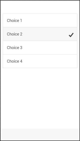
In the following example, there are four radio buttons and the second one is chosen.
<div class = "list">
   <label class = "item item-radio">
      <input type = "radio" name = "group1" />
      <div class = "item-content">
         Choice 1
      </div>
      <i class = "radio-icon ion-checkmark"></i>
   </label>

   <label class = "item item-radio">
      <input type = "radio" name = "group1" />
      <div class = "item-content">
         Choice 2
      </div>
      <i class = "radio-icon ion-checkmark"></i>
   </label>

   <label class = "item item-radio">
      <input type = "radio" name = "group1" />
      <div class = "item-content">
         Choice 3
      </div>
      <i class = "radio-icon ion-checkmark"></i>
   </label>

   <label class = "item item-radio">
      <input type = "radio" name = "group1" />
      <div class = "item-content">
         Choice 4
      </div>
      <i class = "radio-icon ion-checkmark"></i>
   </label>
</div>
The above code will produce the following screen −
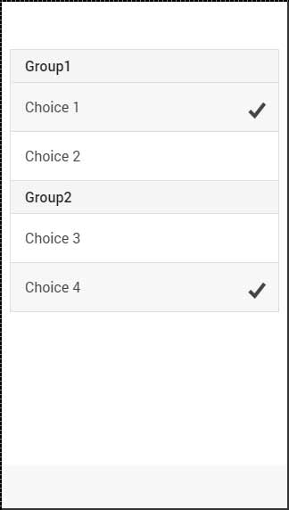
Multiple Radio Button Groups
Sometimes you want to create more than one group. This is what the name attribute is made for; the following example will group the first two and the last two buttons as two option groups.
We will use the item-divider class to separate two groups. Notice that the first group has the name attribute equal to group1 and the second one uses group2.
<div class = "list">
   <div class = " item item-divider">
      Group1
   </div>

   <label class = "item item-radio">
      <input type = "radio" name = "group1" />
      <div class = "item-content">
         Choice 1
      </div>
      <i class = "radio-icon ion-checkmark"></i>
   </label>

   <label class = "item item-radio">
      <input type = "radio" name = "group1" />
      <div class = "item-content">
         Choice 2
      </div>
      <i class = "radio-icon ion-checkmark"></i>
   </label>

   <div class = "item item-divider">
      Group2
   </div>

   <label class = "item item-radio">
      <input type = "radio" name = "group2" />
      <div class = "item-content">
         Choice 3
      </div>
      <i class = "radio-icon ion-checkmark"></i>
   </label>

   <label class = "item item-radio">
      <input type = "radio" name = "group2" />
      <div class = "item-content">
         Choice 4
      </div>
      <i class = "radio-icon ion-checkmark"></i>
   </label>
</div>
The above code will produce the following screen −


