Splunk - Overlay Chart
Many times, we need to put one chart over another to compare or see the trend of the two charts. Splunk supports this feature through the chart Overlay feature available in its visualization tab. To create such a chart, we need to first make a chart with two variables and then add a third variable which can create the overlay chart.
Chart Scenario
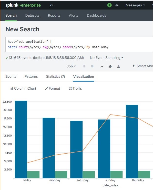
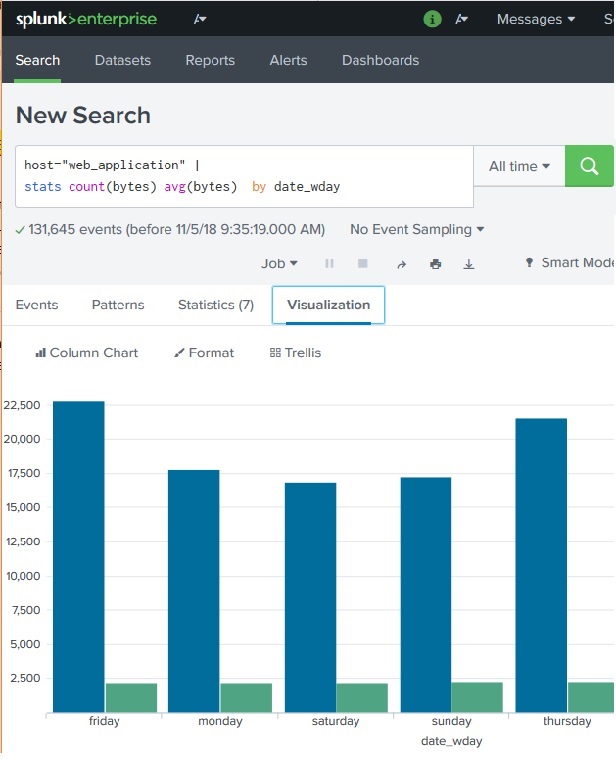
Continuing the examples from previous chapter, we find out the byte size of the files on different week days and then also add the average byte size for those days. The below diagram shows the chart showing the byte size versus average byte size of files on different days of the week.
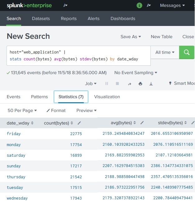
Next, we are going to add the statistical function called standard deviation to the above search query. This will bring the additional variable needed to create the chart overlay. The below diagram shows the statistics of the query result which will be used in the visualization.
Creating Chart Overlay
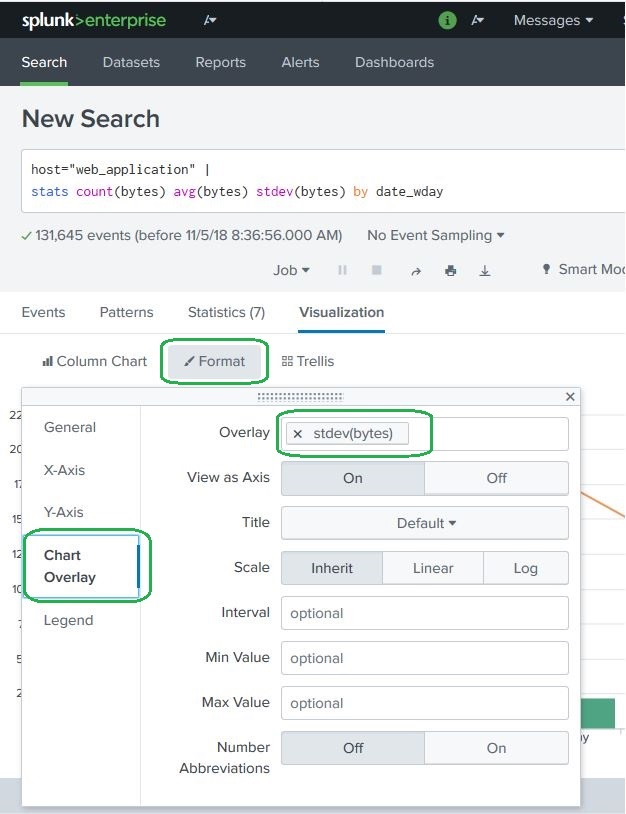
To create the chart overlay we follow the path Visualization-> Format -> Chart Overlay
This brings up a pop-up windows where we need to choose the field which will be the overlay chart. In this case we choose stdev(bytes) as the filed as shown in the diagram below. We can also fill in other values like title, scale and their intervals, minimum values, maximum value etc. For our example we choose the default values after selecting the filed for the overlay option.
After selecting the above options, we can close the chart overlay pop-up window and see the final chart as shown below.