Tableau - Scatter Plot
As the name suggests, a scatter plot shows many points scattered in the Cartesian plane. It is created by plotting values of numerical variables as X and Y coordinates in the Cartesian plane. Tableau takes at least one measure in the Rows shelf and one measure in the Columns shelf to create a scatter plot. However, we can add dimension fields to the scatter plot which play a role in marking different colors for the already existing points in the scatter graph.
Simple Scatter Plot
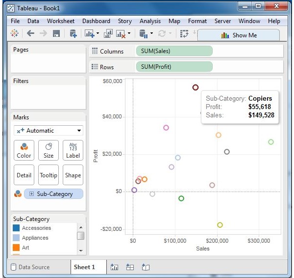
Using the Sample-superstore, let's aim to find the variation of sales and profit figures as the two axes of the Cartesian plane is distributed according to their Sub-Category. To achieve this objective, following are the steps.
Step 1 − Drag and drop the measure Sales to the Columns shelf.
Step 2 − Drag and drop the measure Profit to the Rows shelf.
Step 3 − Pull the dimension Sub-Category to the labels Shelf under Marks.
The following chart appears which shows how profit and sales is distributed across the Sub-Category of products.
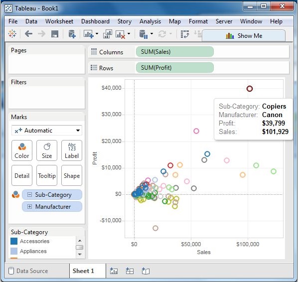
Scatter Plot - Color Encoded
You can get the values color encoded by dragging the dimension Sub-Category to the color Shelf under the Marks card. This chart shows the scatter points with different color for each point.
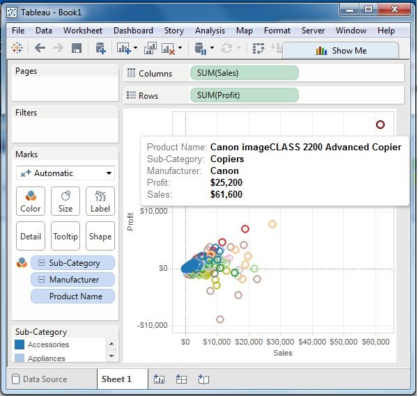
Drill-Down Scatter Plot
The same scatter plot can show different values when you choose a dimension with hierarchy. In the following example, we expand the Sub-Category field to show the scatter plot values for the Manufacturers.